Saturday, April 11, 2009

BEHAVIORAL 4/13


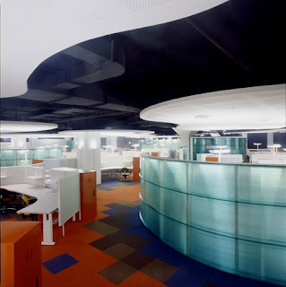
This space is designed to force occupants to behave in a certain way. This is a designerly office space with cubicles built into the design for privacy and efficient working. This image shows several behavioral elements that guide occupants, such as, the floor and ceiling designs. The designer played with ceiling depth by exposing the duct work is some areas and not in other. The ceiling’s curvilinear design forms a path that guides occupants to different parts of the office. The floor design mimics this path, however, contrasts it by using a geometric pattern. The blue and orange colors applied to the floor define the different sections of the space. The orange section is further divided into cubicles that define the individual space of each worker.

Workers behave differently in their individual space, as opposed to the rest of the office. People generally feel more comfortable and confident in expressing their individuality when they are behind closed doors because they feel less likely to be judged. These partitions give workers the opportunity to do just this, which ultimately results in a successful workday. The partitions let the employees know that this is a space where they will be working individually. The blue section of the space is also further divided into cubicles. A soffit is dropped from the ceiling to add interest and help with acoustics. It helps to limit sound that is transferred throughout the space that may disturb fellow coworkers. This part of the office is also blocked off by a curved partition positioned on the floor. One of its functions is to help guide people to walk down a specific path, whereas another function is privacy. From this image, it is suggested that the office that is blocked off is not open to all workers. Most likely, it is comprised of cubicles that are designed for employees of a higher status. This is concluded due to the increase in privacy.

In an office you are required to perform your work to the best of your ability. Sometimes, this includes talking in a normal speaking voice especially if communication or customer service phone calls are essential in your job description. All partitions and soffits in the space help to reduce sound that is transferred from area to area. When an occupant sees these features in a space, they know they are encouraged to speak in a regular speaking voice. Soffits and partitions also make a space feel more intimate, which also encourages an occupant to open communication with fellow coworkers. Lighting is also another technique a designer uses to establish soft or loud communication. In general, softer lighting suggests soft communication, and bright general lighting suggests louder communication. A business depends on communication for success, therefore, bright lighting is applied to the space to encourage louder communication that promotes heavy communication. The bright lighting is also used so employees can easily see the paperwork that is in front of them.

Is there something else in this space that makes people behave in a certain way? If so, what are they and how do people react to those elements?


Image obtained from:
http://images.search.yahoo.com/images/view?back=http%3A%2F%2Fimages.search.yahoo.com%2Fsearch%2Fimages%3Fp%3Dinterior%2Bdesign%26fr%3Dyfp-t-501%26toggle%3D1%26cop%3Dmss%26ei%3DUTF-8&w=450&h=451&imgurl=static.flickr.com%2F156%2F421644136_fff2ca63af.jpg&rurl=http%3A%2F%2Fwww.flickr.com%2Fphotos%2F7396079%40N08%2F421644136%2F&size=50.1kB&name=interior-design&p=interior+design&oid=ceacdfcfb3bbedbc&fusr=Anastasia%21&no=5&tt=1824718&sigr=11j0q5oig&sigi=11ek6tvt4&sigb=135j5tpbl

Monday, April 6, 2009

04-05 SYMBOLIC

This snake-like sculpture is a creation of architect/urban designer Norberto Nardi. It is located in the Dos Lagos development in Corona, California. This particular suburb is directly located on a deserted silica mine. The challenge presented to the designer was to turn two mammoth mining craters into something which would enhance the surrounding community. His solution, transforming the craters into two lakes and building a “bamboo-ribbed” bridge which glides across the extension of the lakes. This bridge symbolizes a river. Approaching surrounding walkways and the bridge blend together into one fluid system of movement which connects all the vital points of this community, acting as a “lifeline”.


The path of the bridge swerves from side to side, gliding across the lakes like the flow of a river, simulating the feeling of walking on water. The bridge is partially enclosed through bent slats of bamboo which partially cave into the walkway, again, simulating the undulating movement of a river bend. Because these bent walls reach only partially up and in varying heights, the ceiling is exposed, exposing the blue of the sky in the shape of a pattern which reflects the shape of a bending river as well . By choosing to turn the bridge into an interior space rather than leaving it completelly open, the designer has created a more intimate setting, and in doing so, created an even stronger sense of community. The bridge itself is constructed of varying materials in warm colors of rust and orange. These contrasting colors allow the water to shine even stronger as center stage.


The bridge also symbolizes a river through context. The structure connects key points of the community and works as a location for businesses such as kiosks and entertainment. The path of the “river” is dotted with scattered gardens just as plant life would be present in the fertile soil of a true river bed. This is very similar to communities of the past. In history, rivers acted as sources of life for the earliest communities, providing fresh water as well as fertile soil for the growth of food. For these reasons, civilizations such as Egypt were born on the shores of rivers like the Nile, acting as a stage for both business and personal life. From there, these civilizations spread into extended communities, much like we live in today. So for that reason, what better way to create a sense of community then through the symbolism of a river?


Through what additional details, could the architect have better simulated a river within the bridge? This structure is very innovative, and to some critics, a bit too progressive. Do you feel that this type of structure is out of place in American Suburbia?

Compositional 4*6


The compositional aspect of an interior directly refers to how the designer applies two-dimensional and three-dimensional composition. Within the space the viewer sees that three dimensionally, the barrels and lighting follow curvilinear lines and organic shapes relating well to the actual shape and theme of the space itself. The straight lines of the table in the middle create contrast compositionally with the rest of the space. The horizontal line on the bottom of the out coves also connect to the table by following the same height as the table top. The shape of the space is reflected in shape of the out coves and direction of the floor. Overall, the space is human scale. The ceiling is not overly arched to make the space feel monumental which allows the space to compositionally be comfortable. The out coves are also scaled to be appropriate for the walls, human viewing, and displays within them. The objects within the space are very proportional. This causes the composition of the space to be balanced. This is created because although the objects vary in size within the space, nothing in particular is overly sized or too small for its surroundings. The space also creates a composition of being very horizontal. This is created within every straight line seen within the space like the barrels lined up horizontally following the walls, the table being so long and three dimensionally the space being a half circle and the floor being the horizontal bottom line under the arc seen in the ceiling.

If the space’s out coves were actual windows viewing the outdoors how would the composition of the space change? Would this change work or take away from the design? What is the best compositional design to this space that makes it work so well or not work? I think the barrels of the space add a lot to the theme and composition of the space, if they were not there would it matter? What if there were only a couple scattered with in the hall or were in a row down the middle instead?

Preferential - 4/6


Designers have a strong influence on how people view and experience a space. Their decisions can make a person feel composed, uncomfortable, relaxed or enriched. When people walk into a space, they experience the whole space at once, and get a sense of the space’s character. The preferences of the designer can give a space a character that is bold, reserved, fun or sophisticated. That character, or defining characteristics give the space an identifiable brand.

Starbucks’ brand is ranked fourteenth in the nation, with competitors like Coca-Cola, Johnson & Johnson and Harley Davidson. They are the top restaurant company according to CoreBrand’s 100 Brand Power Ranking. What makes their brand so powerful? When you walk into the restaurant, you feel this sense of belonging. Their stores become a haven, a break from the worries outside, a place where you can meet with friends. It’s about enjoyment at the speed of life – sometimes slow and savored, sometimes faster, but always full of humanity.

When you walk into a Starbucks, you are greeted by curvilinear lines, used to give the space an organic and soothing feeling. The materials in the space are natural woods and tiles to continue the organic nature. The ambient and task lighting in the space give the customers that comfortable, home away from home feeling. The colors in the space are earthy and muted. All of these design decisions are a result of the preferences of the designer. These elements make up the brand of Starbucks because they are used in every Starbucks around the world. When you walk into a Starbucks, you know what it is going to look and feel like because the power of their brand is so strong.

Have you ever been to a store or business place with a strong brand? How has that place made you feel? Was it inviting or uncomfortable? Are their any techniques you would use as designers to make the brand of that place stronger?

Sunday, April 5, 2009

Pragmatic 4/6


When looking for a space to analyze pragmatically, I thought a hotel lobby would be a great example of how a space functions.  Most hotel lobbies are multi functional; serving as a guest check in space and a leisure area for guests to interact with others or to have some time to themselves.  The lobby is the area that sees the most activity and acts as the central hub for the hotel and a main circulation path as well.  There is a clear path to the adjoining stairway and the front exit.  Rugs are also used to designate paths around the furniture.  The furniture is located a bit to the left, as to not interfere with the main walkway to the reception desk.  The large lighting fixtures above the seating area create a central focus within the space.  Lighting is used throughout the space to create focal points and direct the viewer where to go.  The amount of light is perfect, not too much as to make the space feel sterile, but enough to contrast the richness of the walls and floor.  With the ceiling being so tall compared to the viewer, an abstracted wood pattern was applied to the wall to cancel any loud noises.  With this being such a high traffic area, the receptionist needs to be able to have a coherent conversation with the customer, so the noise level must be controlled.  The space is designed to be very open.  This also allows the employees to see everything that is going on from behind the desk.  This hotel lobby looks as though it balances its many functions well.  The seating area is kept to itself so if a guest wants to sit and read and fade out of the crowd it is possible, even though they are smack dab in the middle of the lobby.  The most noticeable is the area with three black and white chairs.  The white rug and the drop lighting makes this seating area feel sectioned off like it is its own separate space.  How well of a job do you think the lobby does of functioning as a multi-use space? Would you feel comfortable in the seating areas while activities are going on around you?  Do you feel the designer could have done a better job of creating traffic patterns? If so how so?