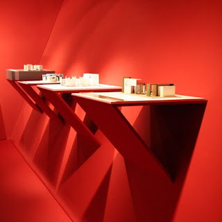

In the following space, the designer desired a sophisticated simplicity, and a room that would allow maximum focus on the artwork being displayed, while still maintaining its architectural boldness.
The following space only consists of one color, red, a strategic choice by the designer in order to create a contrast between surface and artwork. Also, with red being the only color in the space, shadows and light sources become even more obvious, and guide the viewer’s eyes around the room.
Furthermore, due to the architectural models being displayed, the designer preferred to mimic those architectural elements when creating the space. There are various geometric lines, as well an abundance of simple geometric forms, such as the square seating in the middle of the room. Because the room itself is so simple and because it mimics the artwork found within it, the viewer is able to make the space into an experience. The designer was bold in their choices, however, did not want to overwhelm the users of the space. And because every aspect of the room is architecturally simple and related, the room itself becomes another piece of art.
The designer of the following area not only used the same color throughout, but also repeated the same wall, floor, and seating texture. Again, with this simple choice of a constant smooth texture, the designer intended to cause no distraction what-so-ever.
Overall, the space is bold and yet accommodating to the art within it. The designer wanted to direct its user’s eyes around the space with the repetition of color and the shadows it creates. Most importantly, the space is supposed to become an experience. One must take in the beauty of its architectural features, and seating is even provided in order to do so. Furthermore, with the space being so simple, the amount of artwork being displayed is minimal, and the designer definitely attempted an architecturally and aesthetically bold space, but wanted to maintain that constant focus on the purpose of the room as well.
Why do you think the designer made the space the way it is? Do you think the space accommodates the artwork, or takes away from it?
It seems like the designer was trying to design an exhibit space unlike any other, and instead of using varied methods of display or changing the wall color or carpet pattern, she/he simply changed the lighting. This puts into practice the definition of color that we've so recently learned from the Pile book- that color is really only how light affects a surface.
ReplyDeleteThe red light also creates a strange feeling, like you're somewhere different, maybe a photography dark room.
I think that the red light really makes the white architectural models stand out, especially when they're highlighted with spotlights.
I believe that the designer wanted to create a bold space that was different than your average gallery. The majority of the gallery's that I have been in have been painted with either white or an off-white wall color and the artwork has spoken for itself and stood alone. But in this space, the bold choice of red as a background for the models really helps them to stand out. Also, the platforms on which the models sit on are part of the architecture of the room themselves, rather than the models resting on temporary displays. I think that the choice of red in the space is very successful--it's something different that you wouldn't necessarily think it would work, but it does.
ReplyDelete