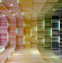
The designer of this space intended for people to feel confused and disoriented within this space. When a person walks into/ through this space many different reactions are possible. The reasons for these feelings are the high levels of contrast in this space, found both in the multiple bright colors used as well as the range of line widths. The designer is also trying to “fool” the eye of the viewer with the application of color. If you look closely at these two pictures of the space you can see that the room gradually gets larger with each rectangular area added, but with the darker blues and violets applied at the end of the space it actually pulls the room in making it appear not to get larger when looking at it straight on. These elements also affect the traffic pattern within this space. When walking into this space a person has no “set” direction as to where he or she should go to maneuver around the space. The only point of emphasis to even direct the person is the large white sign that is hanging in the room that contrasts with the bold colors in the space. The use of line also helps with the flow of the space because horizontal line is dominate throughout the entire space pulling the person forward on into the entire room.

The lighting in the space kind of acts as directional lighting, highlighting the wall detailing on either side of the space, while drawing the viewer’s eye in. The lighting in this space is not dim intimate lighting that would encourage soft communication, it is more of a bright lighting that encourages “loud” communication. The interior flow as I said before and also as you can seen in the pictures, pulls people through the space not encouraging much lingering or a “lounging” feel.
How do you feel when you look at this space? Does this space pull you through or make you want to linger? Is it successful or too overpowering?
I do not think that the designer intended to disorient users in the space at all. The use of all the colors could have been overwhelming for the space, however, the fact that the designer decided to use tints rather than hues, makes the color-scheme rather soft yet still makes a statement. The space actually direct people straight towards the end of the space where the white wall with a logo is located through the use of repetition of straight lines, the square shapes, and lighting. In addition, the use of darker colors towards the end frames and brings contrast to the white walls, which attracts the users even more to walk straight towards the wall. Although tints are used instead of pure hues, the space is still successfully lively and dynamic because of the variety of line widths and different values of tints. I feel very stimulated in the space yet I do not get distracted at all because the designer did not put any ornamentation on the colorful walls. I believe he/she did this on purpose, again, to control the behavior of the users.
ReplyDeleteI agree with Parahita. I think that the designer used the different levels of color and shape of the walls to intentionally pull the observer through the space. It is much more apparent in the second photograph, where the room is shown in perspective towards the end of the hall. The brighter pinks and yellows draw your eye to the entrance and the horizontal bands on all 4 sides lead perspectively to the white wall at the end of the hallway, where the darker colors are. But because of the white sign, the darker greens, blues and violets don't seem as dark and harsh because of that bright contrast against the inset lighting and bright white sign. I think the designer intentionally placed the horizontal bands on all four walls to subconsciously direct the user to the end of the hallway. The use of tints creates a softer atmosphere, even amongst the brightness of the pink. When seeing this space, I was very encouraged to want to advance through it because of it's variety in line and shape and color. I think the designer was very successful in creating a space that was very much visually engaging and I think that if he/she had added anything else to the space--even more lighting--I think that their concept of creating a space the natural flowed with a defined traffic pattern would have been null and void. I want to linger, but I do want to keep advancing through the space. I think the designer was successful in creating a space that controls what the user has to do within the space.
ReplyDeleteI think that the first image of the space is more successful than the second. The second image makes me feel like I’m going through warp speed across space. I think the designer had good intentions about trying to make people travel through the space, by using the progression as a directional tool, but it is too confusing and almost repulsive. The use of the colors on the side and the addition of the lights make this space very cluttered and distracting. If the designer would have made the sides of those sections white, and then included the light, I think it would have worked better. I say this in hope that by having a progression of white, through repetition, would guide viewers to the end of the hallway. At the end of the hallway, the designer could then also use white as the background to give the users a sense of arrival. I just get lost looking at this space, and the overwhelming amount of color does not invite me in.
ReplyDelete