(image source: blog picasa slideshow)
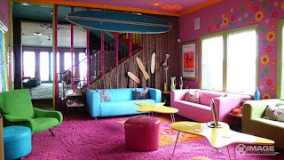
The designer of this space has strong preferences for a retro-referencing design while still displaying slight sophisticated modern tastes. Seventies themes of daisies, surfboards, hearts, and whimsical icons dot the walls and ceilings in highly saturated tones set a tone of fun-loving irreverance. The mid-century modern lines of the coffee tables and arm chairs, along with the surf board suggest a California modern coast house, but the mismatched tropical colors and shapes cover up any amount of self-importance or seriousness.
Because of the clean lines of the staircase, the relatively high ceilings and the open expanse of the room, it seems that the house could indeed have been a more modern style, but the owner was clearly trying to ‘dress it down’ as if to create a beach house out of it. The variety of textures- seen in the fabric on the walls, the carpet, the different upholsteries on the furniture, and the smoothness of the coffee tables and ottomans- give off a deliberately mis-matched feel even though the color palette remains loosely unified under the category of ‘all tertiary’.
The openness of the space, the variety of textures and colors, and the laid back 70’s/California/surf themes gives the impression that the designer of the space wanted several people to be able to congregate in the room and feel relaxed but stimulated by their surroundings. Plenty of surfaces invite spreading out and not worrying about picking up after oneself while the informality of the color scheme and abundance of seating surfaces suggest hanging out on vacation.
What do you think the designer wanted people to do in this space? Was it successful? Do you see a conflict between the design choices or do you think there is a unifying element?
This comment has been removed by the author.
ReplyDelete1) I think the designer wanted people to be wowed and somewhat overwhelmed by the space. The bright colors also provide a light hearted atmosphere. Variations of the primary colors give the space a feeling of immaturity or a childlike sense. I believe the designer wanted to make this room a fun place to interact and have the room be a conversation starter itself. It might even be incorporating the personality of the resident of the space. I think the designer was successful in the design of the space. I would say that the design flows together well. The unifying elements in the space include the color palette, curvilinear line in the furniture, circular shapes, and the use of the color pink on the floors, walls, and ceilings.
ReplyDeleteI think the designer wanted people to feel energized by the space. The bright colors and use of shape create a very stimulating environment. If this was what the designer was going for, it was successful. You can't help but smile in the space. Contrast in the space comes from the existing building. It has clean lines and is more modern. Unifying factors in the space include color, shape and curvilinear line.
ReplyDelete