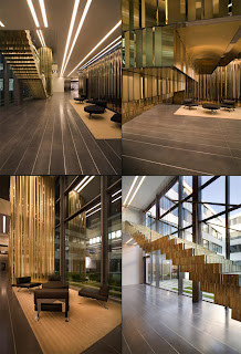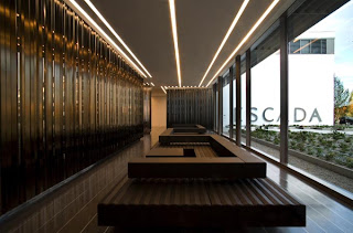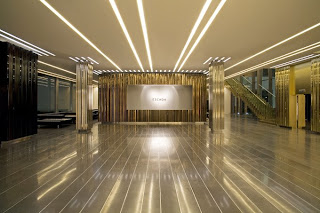


One of the purposes of analyzing design in a compositional way is to see how the designer applied two- and three-dimensional composition within the space and if the two-dimensional compositional floor plan relates to the three-dimensional composition of the space. When doing this one can look at the proportions of the space by asking is the space human or monumental scale and what are the proportions of the individual spaces. The above images were taken in the head office of the fashion house Escada in Munich, Germany. When looking at these images one can see that the two-dimensional floor plan is long and rectilinear. The lines in the flooring material as well as the horizontal lighting in the ceiling help to exaggerate the length and make the building seem longer and narrower. Also, the use of short, elongated furniture mimics the layout of the building. The staircase is another three-dimensional architectural unit that creates a dynamic effect in relation to the two-dimensional floor plan. It stretches over a long span of space and each stair plane is extended creating layers of horizontal lines. Overall, these elements are manipulating the space in a way that exaggerates the length and width. In the same way the height of the building is also being manipulated through vertical lines. The ceiling heights vary in different locations of the building but most of them look to be at human scale. Through the use of vertical line in the wall material an illusion is created that the ceiling’s height is taller than it actually is.
If the building didn’t use vertical lines to exaggerate the height how would the three-dimensional composition of the space look? What would happen if curvilinear lines were added to the space? Do you think that this space has a successful relation between the two-dimensional and the three-dimensional composition?
The space shown seems compositionally cohesive. Straight lines and geometric shapes emphasize the long corridors and exagerate the height of the actual low ceiling. Curvilinear lines would probably not work as well in the space. The long straight lines work perfectly and create choesion in the design of the space.
ReplyDeleteThe two dimensional composition of the space well relate to the three dimensional one. By developing very geometric three dimensional forms off the elongated floor plan, the designer successfully created a coherent composition. I agree with Jessica that the staircase produces variety and brings dynamism in the space by breaking away from the horizontal and elongated floor plan.
Although the space is human scale for the most part, I feel that the combination of the vertical and horizontal lines make it feel almost monumental. Also, the vertical and horizontal lines give the space different proportions throughout the space. If there wasn’t a use of the vertical lines, the three-dimensional composition of the space would be compromised. With the combination of the vertical lines on the walls and the horizontal lines on the floor and ceiling, the three-dimensional space is give a since of being bigger than it really is. Without one line or the other the three-dimensional composition is lost. If curvilinear lines were added to the above space, I feel it would ruin the composition. The curvilinear line would just not work. I feel that the above space has a very successful relation between the two-dimensional and the three-dimensional composition. I feel that nothing should change!
ReplyDeleteIf the vertical lines that exaggerate the height of the room were eliminated from the space the room would take on a completely different image. The room would look almost squatty and short. The three-dimensional composition of the space would alter dramatically. For instance there is a dominate use of horizontal and diagonal lines. When the vertical lines are taken out there is an even greater emphasis on the other line types. If curvilinear lines were added to the space i do not think it would ruin the beautiful image it already has. The only catch is the amount of curvilinear line added would have to be very minimal, a mere contrasting focal point such as a lighting fixture or something of that nature. I strongly believe that this space has a successful relation between the two-dimensional and the three-dimensional composition. The room works together as a whole very cohesively. The only thing i could suggest to change is to create a focal point that really pops.
ReplyDelete