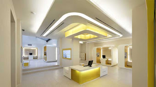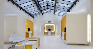

It is interesting to think how many different buildings we can design and change; however sometimes banks are often forgotten. One main cause for this is the increase in online banking, making the bank itself less important to the average person. If however you are forced to visit a bank, it is not the most exciting experience; rather they are boring and conventional. Since this decrease in bank designs, many designers are pushing for new concepts concerning the interiors of banks. The image above is of the CheBanca in Milan designed by Crea International. The design reflects the company’s simplistic, clear, and innovative approach toward banking. The goal of the project was to bring life and spirit to the company as well as focus on the essentials.
The space itself, through a pragmatic sense, is very successful. The central focus is straight to the main desk. This is accomplished through not only its location, but also the focus created through the ceiling plan. The lighting in the space also adds to the overall sense of place. It opens the space with its brightness. The lighting is also complimented by the use of yellow. The color yellow is not aggressive, but rather exciting and energetic. The traffic pattern is clear as well. The path of travel is clear and unobstructed, and is also assisted by the use of yellow as visual way. Overall the pragmatics of the space have been thoroughly thought out and effectively addressed.
By looking at a space such as this bank, what other buildings in your opinion have become forgotten? What ways can they be rethought or redesigned? Why have they become less important, or why have they always been less important? If you could pick a type of building to rethink what would it be and how would you address it?
To me this looks nothing like a bank I am use to seeing. I feel that coming into the interior the space from door to desk is clear and gives a straight visual path from point of entry. Yet, I feel that the overall function of the space is somewhat lost. The path of travel is unobstructed, but is it truly clear? The desk is about the only place I would know where to go. Other than that I would get lost because everything looks the same and doesn’t have defining areas. I feel that the individual functions of the space are related through the décor but not really to each other. Where is the teller desk or is that all of the little pods? Or is that loans? The design makes me unsure. It seems as though there is enough lighting in the space and noise should be an issue. Yet, to me privacy would be an issue because the pods are open to the space and can’t be closed off. I don’t want to talk about my money if others can hear.
ReplyDeleteOther buildings that may be forgotten to me are, schools, museums, and libraries. I think for these spaces they need to be rethought completely just like the bank above. I don’t think these spaces have become less important, but more of forgotten about over time because they have classic uses. The type of building doesn’t matter to me but I would address it to give it a new outlook, I new concept to its use, and make it better than what it has been in the past.
Everyone needs to feel a sense of trust and stability in the bank they choose to put their money in. Unfortunately, due to the current economy, money takes top priority for most people. When searching for a bank people like tradition. They feel comfortable going to a bank that they know is successful; maybe one that has been around for a while. I would not feel comfortable putting my money in this bank. I am use to seeing banks that feel secure. Ways this is shown is through brick, a stable material, and security mechanisms. The second image shows a clear directional path, which is successful. However, looking at the first image, I would have no idea who would be able to help me. There needs to be clear signage.
ReplyDeleteIn my opinion, I think the interior design of schools have been forgotten. I think this is mostly due to costs. Designers of schools (elementary and highschool), have found a design technique that works, so they stuck with it. They design each space within the building so it can be used for multiple things. For example, a gym is often used as a cafeteria, aethletic department, and auditorium. This saves space, but then the quality of design is lost.
Schools should be a place that encourage students to want to learn, and spark their imagination. One way kids learn is through interaction with others. One way to help with this is to design an aesthetically pleasing lounge area that encourages conversation.