mySHH where students create change.
Hello!
Have you ever heard of Students Helping Honduras?
SHH is a non-profit organization created by students and run by students throughout American Colleges. The goal of SHH is helping Children of Honduras and their families that were hit by hurricane Mitch and were left witout a house. SHH's objective is to provide these individuals with a safe place to sleep in, clean water to cook and clean themselves, electricity to power their homes at night and education to all kids.
SHH's goal is BIG! But you can help!
I have created a page that you can access through the link
and donate money to my cause to ultimately help kids and their families in Honduras! Think what a small amount of money can do to help them!
Please visit my page and help me!
Thank you!
Tuesday, March 23, 2010
Monday, April 27, 2009

4/27 Symbolic
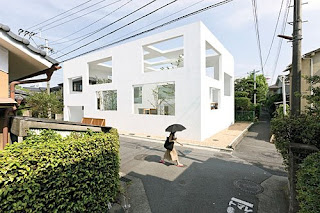


Though at first thought, symbolism seems to apply to churches and places of importance; however, I have chosen to analyze a home in regards to symbolism. The N House is a set of three nesting boxes that have specifically located wholes. This house is in Japan’s southern island Kyushu and was designed by Sou Fujimoto. The concept for this space was focus on the idea of implication and symbolism, rather than harsh definition. Instead of sharply dividing private and public domains, the white shells contain a gradual transition to more intimate spaces. It was also important to balance the solid surfaces and large openings, making sure there was enough protection. The shell incorporates an exterior space which continues to ambiguously define the house and the street. The biggest shelter is an L shape and measures to 1,895 square feet. The middle box covers a donut-shape space with the entry foyer at the front and measures 635 square feet. The final box serves as living and dining area and measures to 195 square feet. What makes this space so unique are the 44 rectangles cut from its three shells. When considering the position of the openings, the sun as well as the sight of line guided their locations. When looking at this house, it is hard to focus and clearly define specific areas. Instead the architect stressed the importance of implication and symbolism. Rather than being told exactly how to function and interact with the space, there are the suggestions of special divisions, making the space a unique experience.
Within your own home, apartment or dorm, what are symbols that this house does not have? Do you feel that it would be difficult to function efficiently within this space? Other homes such as the Farnsworth house have pushed the ideas and symbolism of the typical household. Do you think this will trickle down and inspire the mass produced homes, or do you think most homes in America will continue to look like a suburban cookie-cutter?
Within your own home, apartment or dorm, what are symbols that this house does not have? Do you feel that it would be difficult to function efficiently within this space? Other homes such as the Farnsworth house have pushed the ideas and symbolism of the typical household. Do you think this will trickle down and inspire the mass produced homes, or do you think most homes in America will continue to look like a suburban cookie-cutter?
Sunday, April 26, 2009
Compositional


When I thought about a space that would be easily analyzed compositionally, I thought about theaters. When I saw the Sydney Opera House I knew it was an amazing space and I had seen it before, but the interiors are so complex and the design is very interesting. The Opera House as anyone would expect is on a monumental scale. A human would feel completely insignificant in the space. The exterior of the building itself demands attention, but upon entering the space one is overwhelmed with a sense of awe. The geometric shapes that form the shell of the building are repeated within the interiors to create a connection. The composition of the space delegates how people interact and view the space.
The main purpose of the space is to provide an area to view theatrical performances. The designer intentionally arranged the seating in ways which allowed the show to be viewed from multiple sides. All two and three dimensional aspects of the space are rectilinear and have a central emphasis on the stage. Your eye can follow any line in the space to that central focus and the reason why everyone is there. This sectioning of seating and strong use of line creates isles and forms specific traffic patterns through the space.
Although the building itself has one specific purpose, there are individual spaces (mostly the separate seating areas) that are all similarly proportioned. The largest areas though are the stage and the massive step seating area directly in front of the stage. The designer did a very good job of relating the floor plan to the three dimensionality of the space. When I look at the interior of the Sydney Opera House, it reminds me of a symphony. I am not exactly sure of the designer’s intent here, but it feels as though it embodies what an opera house should be. When you see these pictures how do you think the space would make you feel? Do you feel as though the designer did a good job of relating both the two and three dimensionality of the space? How do you think the designer wants an person to feel in this space?
4/27 Pragmatic

As design students we can vouch that it is important to have ad
equate space for designing as well as an adequate creative environment. When renovating the Slocum Hall, home to the Syracuse University School of Architecture, a variety of specifications needed to be taken into consideration in order to successfully revamp the space.
Garrison Architects looked into a variety of issues, specific areas for pin ups, open atmosphere, architectural interest, as well as green design. During the renovation of Slocum Garrison discovered a lot about the building. Over th

e years it had been divided and adapted to house a growing number of students and faculty. By doing so a lot of the “interior details were lost; partitions were added; the central atrium was filled in. Time and again, immediate spatial needs demanded the sacrifice of airflow and
natural light” (Brake). During the renovation Garrison opened the space exposing again the atrium, allowing natural light and proper airflow to enter the space. This can become important when there is a large occupancy so that the room temperature stays comfortable, further helps to provide a creative atmosphere. Garrison designed the space so that activity would radiate outward from a central atrium, providing a common area space. Adequate space for student pin ups was a major issue in our own building Funkhouser Garrison addressed this common issue by providing a “double-height gallery for student displays and touring exhibitions” (Brake).

He also hung panels made of recycled paper for more pinup surfaces in common areas. All of the redesigning was done using green materials.
Based on the Renovation of Slocum, how many buildings do you think have underlying layers that actually work for the space? Where through time we have distorted it’s original logical design. Garrison stated that “things have a way of coming back around.” Would you agree with his statement? If so in what ways do you see design turning back around?
4/27-WILD CARD-Behavioral


 Designing to influence how people interact within a space is extremely important, especially when people must work together. Many companies are beginning to design corporate offices that will enhance positive behaviors or attitudes of employees and help them to embody company values. One example of this at the Yahoo! corporate office in Switzerland. Being a more free-thinking, open-minded, and casual place to work, they have developed an office that strongly supports these characteristics. As shown in the pictures above, most of the meeting areas within the space have been designed and decorated to resemble outdoor settings, including a rocky waterfront, a dairy farm pasture, and the exterior of a log cabin. They not only have seating that follows these themes, but also have murals depicting sprawling natural environments adorning the walls. Natural environments have been proven to support productivity and help to boost the morale and positive attitudes, so this could be very important in helping Yahoo! employees work together. The casual spaces supportive of productivity and optimism inspires workers to think more freely and openly collaborate with one another to get things accomplished. It not only inspires creativity, but also influences their creative minds. A fun, interactive, and informal environment like this is much more conducive to the creative process than a formal, more sterile office setting.
What are some other companies that have used this tactic? How could a work environment that is much more structured and strict be conveyed through the interior design? Which type of work environment could you see yourself working in and why?
4/27 - PREFERENTIAL
In order to create the best design possible, designers must always be conscious of the decisions that they make within a space. Elements of the space, such as the lighting, the setting, and/or the function, may dictate how the designer proceeds with their design.
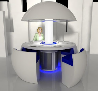
Turkish designer, Fatih Can Sariöz had to consider these same elements when he designed the “Kure” pod. The “Kure” pod is a futuristic idea for a modern dining table and/or sitting area. Sariöz believed that quality time with the family has diminished in the past generation and was thus motivated to create a table that would bring everyone closer together (“Kure”). Sariöz’s desire to bring people closer was accomplished through the shape of the table. The round, circular design of the “Kure” creates a more intimate space and encourages more face-to-face conversation. Sariöz also strived to create an atmosphere appropriate for family and friend gatherings. People tend to be most as ease when they’re with family and friends. With this in mind, Sariöz decided to add a touch of blue to his design in order to create a fun and relaxed atmosphere in which people felt comfort to interact. The lighting used in the “Kure” pod also helps to create this atmosphere. The central tube, which supports the roof-like component, provides strong, general lighting around the center of the table. The recessed lights within the roof component are a little softer, but help add more light around the edge of the table where people are sitting. This strong, central lighting also creates a more intimate space.
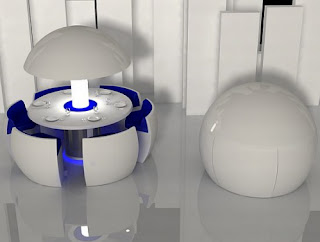
When designing the “Kure,” Sarıöz also considered how many people these days desire more space within their homes. Thus, the “Kure” pod was designed to close into a spherical shape, which conceals the six chairs and table (“Kure”).
How successful do you feel Fatih Can Sarıöz was at creating an intimate dining table? How do you think the design could be improved? Do you think this design is feasible, or is it too futuristic?
“Kure: The Modern Round Dining Table and Chairs in a ‘Pod’.” Furniture and Fashion. 2009.
.

Turkish designer, Fatih Can Sariöz had to consider these same elements when he designed the “Kure” pod. The “Kure” pod is a futuristic idea for a modern dining table and/or sitting area. Sariöz believed that quality time with the family has diminished in the past generation and was thus motivated to create a table that would bring everyone closer together (“Kure”). Sariöz’s desire to bring people closer was accomplished through the shape of the table. The round, circular design of the “Kure” creates a more intimate space and encourages more face-to-face conversation. Sariöz also strived to create an atmosphere appropriate for family and friend gatherings. People tend to be most as ease when they’re with family and friends. With this in mind, Sariöz decided to add a touch of blue to his design in order to create a fun and relaxed atmosphere in which people felt comfort to interact. The lighting used in the “Kure” pod also helps to create this atmosphere. The central tube, which supports the roof-like component, provides strong, general lighting around the center of the table. The recessed lights within the roof component are a little softer, but help add more light around the edge of the table where people are sitting. This strong, central lighting also creates a more intimate space.

When designing the “Kure,” Sarıöz also considered how many people these days desire more space within their homes. Thus, the “Kure” pod was designed to close into a spherical shape, which conceals the six chairs and table (“Kure”).
How successful do you feel Fatih Can Sarıöz was at creating an intimate dining table? How do you think the design could be improved? Do you think this design is feasible, or is it too futuristic?
“Kure: The Modern Round Dining Table and Chairs in a ‘Pod’.” Furniture and Fashion. 2009.
Subscribe to:
Posts (Atom)