Monday, April 13, 2009

4/13/09 Pragmatic


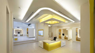
It is interesting to think how many different buildings we can design and change; however sometimes banks are often forgotten. One main cause for this is the increase in online banking, making the bank itself less important to the average person. If however you are forced to visit a bank, it is not the most exciting experience; rather they are boring and conventional. Since this decrease in bank designs, many designers are pushing for new concepts concerning the interiors of banks. The image above is of the CheBanca in Milan designed by Crea International. The design reflects the company’s simplistic, clear, and innovative approach toward banking. The goal of the project was to bring life and spirit to the company as well as focus on the essentials.

The space itself, through a pragmatic sense, is very successful. The central focus is straight to the main desk. This is accomplished through not only its location, but also the focus created through the ceiling plan. The lighting in the space also adds to the overall sense of place. It opens the space with its brightness. The lighting is also complimented by the use of yellow. The color yellow is not aggressive, but rather exciting and energetic. The traffic pattern is clear as well. The path of travel is clear and unobstructed, and is also assisted by the use of yellow as visual way. Overall the pragmatics of the space have been thoroughly thought out and effectively addressed.

By looking at a space such as this bank, what other buildings in your opinion have become forgotten? What ways can they be rethought or redesigned? Why have they become less important, or why have they always been less important? If you could pick a type of building to rethink what would it be and how would you address it?

4/13 Compositional


The following composition of this particular space is very specific and deliberate. The three dimensional elements of the space are curvilinear, like the circle created along the wall, and are repeated with the overhanging ceiling, as well as with the large seating area. This repeated shape allows for organization and precise traffic patterns, which are important in a work environmental and allow for less distraction. Furthermore, the scale of the space is quite large, giving the interior a feeling of importance, which overall suits the space due to the official activity happening within it.

However, with its monumental quality, all the aspects of the space are rather proportional. The wall, the main focal point of the room, is extremely large. But with the large wall follows the large seating arrangements which have been constructed to repeat the shape, as well as the size of the screen. Therefore, although the wall may seem proportionally large, the rest of the space has been altered so that a certain balance is created in the room.

Compositionally, the space is very rounded. The repetition of a constant curvilinear form creates order in the space. Furthermore, with each repeated form, a new area is designated, like the center lighting area constructed by the use of another circular shape. This separation of spaces allows for optimum function and order.

Compositionally, what is the most successful element of the space?
Compositionally, what is the least successful element of the space?
If another repeated shape was used, would the space be as successful?

Sunday, April 12, 2009

Wild Card (Preferential)-4/13

Something that one can find on almost every corner across six continents creates a “familiar home” with a never ending sense of welcoming. Their iconic golden arches create the most recognizable burger chain on Earth. This place is known as no other than McDonalds. The world has been depending on McDonalds for that irreplaceable, quick meal for over half a century.
McDonald's is the leading global foodservice retailer with more than 31,000 local restaurants serving more than 58 million people in 118 countries each day. Although McDonalds is known as one of the most recognizable brands on earth, change is still inevitable. As we have become more health conscious, McDonalds has responded with a wide variety of salads and fruits to choose from. As the world has become more internationally minded, so has McDonalds. In Norway, they serve the grilled salmon McLak, and Japan serves green tea-flavored milkshakes. And finally, as the world has become more design conscious, once again McDonalds has as well. The recurring use of hard immoveable chairs and tables create the ultimate essence of the pure function of McDonalds. This function creates a place where customers are in and out quickly without lingering or lounging. The sole purpose of the interior is to have a quick meal and leave, unlike places like star bucks, where they offer comfortable seating and large tables to spread out on.
McDonalds is constantly recreating its brand in practically every possible way. But today, some of their restaurants are becoming more and more comfortable. Seating is softer, and the restaurants have developed different territories which create different functions. Through these new designs, conversation is encouraged, as well as comfort.
Although McDonald’s golden arches will most likely never die, its interiors and menus are constantly changing. How do you think in the future McDonalds will continue to alter its brand? Since the menu is taking turns in the direction of a café, do you think that it will develop into something similar to Star Bucks, where lounging and conversation is encouraged? Where do you think that the line should be drawn to where McDonalds original intended brand isn’t completely transformed? Please explain your answers.

4/12--PREFERENTIAL


Preferential design decisions are based on preferences of designers and how they showcase that within a space. These decisions may be what the designer wants, but what is important is if those designs are appropriate or not for the space. This space is a hotel design for the NYLO Hotel in Plano, Texas. The main design is meant to be an urban, exciting and fun lifestyle experience while on the road. It is meant to be a business hotel that is a bit different. This space shows a contrast and compliment between two different aspects in the area: new technology and affordable upscale hotels. The space itself is a very urban geared design with exposed concrete walls and a lot of tan and beige tones, seen through the wooden chairs’ couches and the upholstered hanging bubble chairs.

The urban influences are very apparent. There is a mixture of curvilinear elements and rectilinear elements that compose the main lobby area. The architectural elements are extremely neutral and rectilinear. The wood elements are used in the bench/sofa seating and bookcases are placed around the perimeter of the room to create a boundary and are the main supply of color.
The curvilinear elements are found in the tables, the light fixtures hanging down from the ceiling, the bubble chairs and the rugs to the right of the reception desk.


They are repetitions of circles within each element. The light grays that they are composed of help to create a soft, soothing interior color scheme. They give the impression of a very upscale, high end hotel, which contrasts what it actually is.


The lighter, softer grays help to add to the lightness of the space, since the majority of the space doesn’t house many lights. On the back wall, there are a couple of windows, and task lighting over the desk, but the majority of the light coming into the space is reflected off of the metal HVAC equipment.

Although the designer wanted to make the space more modern and up-to-date, they chose to use neutral grays and tans. If they had added a bolder color, such as red or orange, do you think that the space would have a different feeling? Do you think that combination of the rectilinear and curvilinear furniture elements work? Would the lobby have a different feeling if everything was rectilinear, like the wooden slat bench, or if the seating was all like the bubble chairs hanging from the ceiling?

Photos from http://www.top-hotels-restaurants.com/2008/07/nylo-hotel-texas/

SYMBOLIC - WHEN A CHURCH BECOMES A NIGHT CLUB

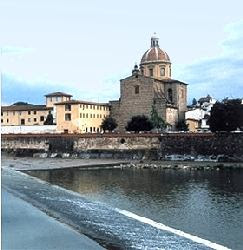
Santa Maria del Carmine in Florence is one of the most known churches of the historical center and it brings thousands of tourists every year to visit the famous Cappella Brancacci.
The Historical Center of Piazza del Carmine counts several churches of different religious cults: Catholic, Protestant and Anglican are some of them.
Recently, the desecrated Anglican Church of Piazza del Carmine has been purchased and renovated by one of the most famous fashion designers of Italy, Roberto Cavalli. From a symbolic perspective, the church itself preserves the typical characteristics of a sacred structure. The façade is tall and looks out on the flat piazza. The Latin Cross layout remains and at the intersection of the transept and main nave the altar is found. During the day, the piazza seems like any other sacred place – quiet and holy. During the night however, this area becomes one of the most crowded of Florence.
The desecrated Anglican church becomes a night club and all its religious symbolism is taken over by a secular world. The interior is reinvented and the luxurious high ceilings of the main nave are lit by fluorescents lights. The symmetry of the Latin cross layout is maintained, but the benches facing the altar are relocated and moved around to create small lounge areas within the larger nave. The altar itself loses its religious connotation, but preserve all the Christian symbolism. It is still the focus of the space and in fact functions as a deejay station. Music and nightlife become the focus of the space.
The niches on the side aisles retain their function – they are kept as comfort areas away from the chaotic atmosphere of the night club. The cross vaults are maintained and relate back to the symbolism of the Church.
The pictorial icons of Christ and Saints are replaced by secular posters and photographs. Comfortable chairs are chosen on the place of wooden benches. Smooth and shiny materials contrast the concrete walls of the original structure.
Overall, the edifice was redesigned to accomodate a different public, but it still preserve the main symbols of a church, although reinvented. Do you think the architect/designer kept in mind the religious symbolism of the structure when remodeling the space? How so? Do you think this is the appropriate space to turn into a nightclub (keep in mind that the church was desecrated for decades and not in use)?