Saturday, April 25, 2009

4/27 - Behavioral


With parents said to be lashing out a cool $1 billion a year on kids birthday parties, its easy to see that the kids’ party industry is a gold mine. As children's taste develop, so too does their demand for the latest and greatest (think Veruca Salt in Willy Wonka). For some parents, the age old sleep over is being replaced by a girls night out at Alton Towers Hotel in the U.K.


The hotel has it's own children's Sleep over Suite, a theme room which caters for up to six sleeping princesses who can indulge in the ultimate girls slumber party. This space allows girls to behave like girls. The sound proof room is perfect for 3am giggling fits and Justin Timberlake blearing throughout the night.


The suite is divided into two areas. The party area features an over the top entertainment system, karaoke, mini dance floor and a pink fridge filled with ice cream. The sleeping area boasts chill out beds which connect into one big bed for six occupants, a wall to wall mirrored bathroom which is flowing with pampering products from U.K's leading brands. (limitless branding opportunities here).


At $560 per night, mom and dad have outsourced the kids’ birthday party and only have to worry about the drop off and pick up. The hotel allows girls to be girls, no matter what the age. The preferences of the designer has made these hotel rooms into princess palaces. The pinks and purples, products, and fixtures give the girls permission to be themselves. They don’t have to act sophisticated or reserved, but they can be noisy and spontaneous in this space.


Do you feel that you could connect with your inner girl in this space? Do you think that older females would enjoy this space as well as younger girls? Would you consider this hotel for a bachelorette party, birthday party or girls night out party? What changes, if any, would you make to have this hotel room better fit your needs?

Monday, April 20, 2009

4/20-Pragmatic


This building, an exhibition hall in Madison, Wisconsin called the Alliant Energy Center, has been successfully designed from a pragmatic standpoint. Because they house such a variety of events, exhibition halls must be able to adapt to many different users from a multitude of backgrounds, and they often house an extremely large number of visitors for any given event. In this case, the neutral grey tones of the entire space lend themselves well to adaptation for different events, as the grey can bridge the gaps that bolder colors may not be able to. Although the color scheme is more achromatic, the wide range of shades used help to delineate spaces within the building and add interest. Also, the use of large walls of windows brings in more natural light to soften the space, which could otherwise be considered very sterile. Extremely wide walkways leading to hall entrances can accomodate the large number of users moving in and out of the space to avoid traffic jams. This keeps circulation within the space moving freely. Next, each entrance to a hall is marked by a protruding sign that can be changed to display the event which is being held inside. This signage helps to guide visitors to their destinations. Another object used for wayfinding is the large cylinder stationed above the main staircase. This creates a strong focal point within the space and draws the visitors toward it. It makes access to the next level easy to find, and also provides a strong landmark within the large, open area. Benches along the walls provide resting place for visitors who have been on their feet for an extended time, or who are waiting to meet someone. Overall, the lobby space is very accomodating and easy to read.


Next, the interior of each hall within the space is extremely plain when not in use. It was successfully designed this way in order to allow for the customization for the different events held in the space. Designed in such a way, with bright even lighting, it can be completely transfromed for the events held there. This can be seen in the two examples below, one of a banquet, the other of a Garden Expo.


Based on the design of this exhibition hall and how it can adapt to a variety of users, can you think of any other buildings that must demonstrate a great deal of versatility within their design? What are some other ways that this versatility can be acheived? In your opinion, onsidering such varying uses for the building, would the addition of color detract from the design? Please explain.

4 > 20 > BEHAVIORAL


In 2005, the Indonesian Island, Nias was struck by a combination tsunami and earthquake. The disaster killed hundreds and destroying 90% of what little built structures they had. Thousands of islanders were displaced and children were orphaned. In 2007, the Catholic relief organization Caritas Osterreich, and the design team from the school of Architecture at Vienna University of Technology in Austria, teamed up to create a recreation center for these orphans. It was built May 2007 on the northeast coast of the island and was titled “Nias Design-Build Project.” For eight weeks, the team worked with the local people and became a part of their community
The team was presented with the task of creating a 2,000-square foot hall which would accommodate the children’s various recreational interests while serving as a meeting and dining place while remaining playfully dynamic and physically transformative. And all of which was to be done within a strict 58,000 budget on a difficult topographical landscape.


Through the use of sliding doors and folding walls, the building was segmented yet gave the flexibility to become an open plan. Running through the body of the building is a long atrium which follows the downward slope of the rocky hill it sits upon. This atrium acts as a communal sitting and play area, auditorium, and stairway while also providing a circulation of air to keep the children comfortable while playing. At the lowest point of the atrium is the music room which can be opened up to the surrounding area, extending the space further for use during theatrical productions. Located at the very top of the atrium is the library which can be opened up to look down upon the music room, lending itself to additional seating, as well as air circulation.

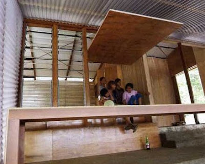
The entire space is taken advantage of with ladders, nooks, and jumping areas. The entire space is turned into a play area, rather than creating a separate play room. In this way, it was possible to actually make the play room larger rather than having to squeeze it into some smaller available space. Also, this encourages these burdened children to incorporate fun and optimism into everyday activities rather than setting it aside for a different time. This project acts as a symbol of a hopeful future for the children and entire community of the Nias Island survivors.

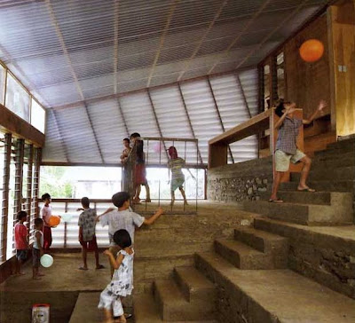
Do you think some clients are in greater need of design than others? As a designer, do you feel that some projects are more valuable than others? Can you think of any other examples of designs which have played such a strong role in the development of a community, perhaps someplace closer to home?


Preferential

Preferential designs are based on the preferences of the designer and how they decide to implement and express that into their design. Even though this is the designer’s choice, it’s still important to create an appropriate design.

Arthur Casas placed his own House in Iporanga deep in the Atlantic forest, the ideal Brazilian landscape for himself. This allowed the architect to have the ultimate expression of his relationship to the surrounding world through the blank canvas he was able to create a home from in the forest.


Two symmetrical rectangular cubes face one another on the north and south sides of the area. They are connected by two retractable 36 foot-high glass walls which frame the main living and dining areas of the house. The exterior of the house is paneled in Cumaru wood which blends into the surrounding landscape. The Cumaru wood is also used inside as flooring. This contrasts against the stark white walls. The white used in the walls is the only “color” seen in the minimalist space.


Casas divided the ground floor into distinct public and private areas. The entire space is connected by the vast living room flanked by wood terraces on both ends. There is a floating Cumaru stairway leading to the first level. A narrow bridge crosses over the middle of the living room and leads into the north side of the space.


The main objective of Casas’s design was to provide an escape into the Brazilian forest for himself. He has accomplished the creation of a personal retreat, a place where he is able to relax and recharge, through his own personal design decisions.

Even though Casa’s designed a personal escape for himself would you find yourself feeling just as relaxed and comfortable within the space? Do the modern, sleek design elements (i.e. the horizontal straight lines) contrast too much with the surrounding relaxed landscape? Would you feel too exposed and vulnerable with so much glass surrounding you in the space?

Sunday, April 19, 2009

4/20: Wild Card, Behavioral


Lately the design world has been discussing the use of branding to create an experience. Many companies use branding to create a uniform experience in their stores. How does branding affect behavior? Branding is a company's way of telling you how to interact with the product, space, etc. Branding can be found everywhere from packaging of products, retail design, to what we as humans wear.

Aesop is an up and coming skincare line based in Australia. Besides having great products, part of their appeal is the store design. Each store has its own design. This keeps customers coming because they want to see what a new store will be like. The modern design of the retail spaces gives the products a high end feel. Customers are more likely to pay extra money because of the surroundings. This was in the forefront of the design, to create a space that makes the product stand out and give the product more value.

Though Aesop has a different design for each of its stores, the company has some commonalities in each of its designs. Those commonalities are the use of water, modern design and streamlining the space. Another driving principle is Aesop design is sustainability. Each of the stores is designed in relation to its location, which adds to the ambiance. Another idea that is translated throughout all the stores is the idea of customer interaction. The spaces are designed so that customers can browse, pick up products and therefore be more likely to purchase.

Do you think that Aesop's brand influence behavior in their stores. Does the idea of each store having its own design work or is it to hard to connect back to the brand? Would you be more likely to purchase something from this type of store or the cookie-cutter stores like Sephora?

All images come from The Cool Hunter:http://www.thecoolhunter.net/stores/

Symbolic 4/20


Symbolism has been used in architecture and interior design for years. It is a way to make the viewer really connect with the environment they are in. In this case the architecture is designed to symbolize adolescence and childhood. Growing up as a child I can recall they days when I would climb up into my tree house and simply get away for a while. Almost every person can recall memories like this or to something of this nature. Children love to climb things and be adventurous. These pieces of architecture are merely grown up versions of tree houses. A German company called Baumraum designs and builds theses solid tree houses out of all natural materials. Each one is individually designed based on the wants of the client and the preexisting layout of the land.


They can be constructed from practically any wood type and can be places people can virtually live in. The treespaces walls are insulated giving ultimate protection for the outdoor climate. “They can be outfitted with sitting and sleeping benches, storage spaces, a mini-kitchen, heating, glass windows, lighting, as well as a sound system for multimedia” (www.thecoolhunter.net). The houses are even eco-friendly since they are attached with ropes minimizing the impact of stress on the trees it sits on. They truly are tree houses designed with an older market in mind.


“As we get older, the urge to climb trees subsides as we ride elevators up to our offices in the sky and look out across the cities where we live” (www.thecoolhunter.net). Even though these urges go away it is still nice to come back and visit the pleasant memories of our youth. In truth it all symbolizes humans wants to be kids again. Children do not have to deal with all the pressure of adult life. They go to school, eat a snack, and go play outside. We want to return to those memories and think about them ever so often. These houses truly are a place people can go to “climb trees again.”

Do you believe this space could make you feel like a kid again? If so how?
It is almost to childlike is some aspects?
How could these treespaces be appeal even more to an adult audience?

COMPOSITIONAL 4/20


One of the purposes of analyzing design in a compositional way is to see how the designer applied two- and three-dimensional composition within the space and if the two-dimensional compositional floor plan relates to the three-dimensional composition of the space. When doing this one can look at the proportions of the space by asking is the space human or monumental scale and what are the proportions of the individual spaces. The above images were taken in the head office of the fashion house Escada in Munich, Germany. When looking at these images one can see that the two-dimensional floor plan is long and rectilinear. The lines in the flooring material as well as the horizontal lighting in the ceiling help to exaggerate the length and make the building seem longer and narrower. Also, the use of short, elongated furniture mimics the layout of the building. The staircase is another three-dimensional architectural unit that creates a dynamic effect in relation to the two-dimensional floor plan. It stretches over a long span of space and each stair plane is extended creating layers of horizontal lines. Overall, these elements are manipulating the space in a way that exaggerates the length and width. In the same way the height of the building is also being manipulated through vertical lines. The ceiling heights vary in different locations of the building but most of them look to be at human scale. Through the use of vertical line in the wall material an illusion is created that the ceiling’s height is taller than it actually is.
If the building didn’t use vertical lines to exaggerate the height how would the three-dimensional composition of the space look? What would happen if curvilinear lines were added to the space? Do you think that this space has a successful relation between the two-dimensional and the three-dimensional composition?