Monday, February 9, 2009

Behavioral


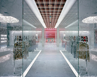
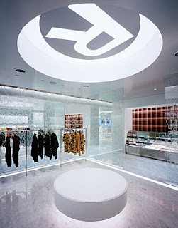
As you look at this space, the Go Ape! store in Tokyo, you immediately see color and lighting as the main focus of the space. That was the intent of the designer. He chose the bright colors, and the 26-ft. LED screen wall to overload the senses and create a new original experience for the costumer. Though the space may seem busy with all the different textures and colors, the floor plan is much simpler with its clear open circulation patterns. Near the main body of the boutique, there is marble flooring and, silver and pink aluminum wall panels which distinguish the men and women’s areas. This allows for clear direction through the space even though it seems to be sporadic and irregular.


This store creates an exciting and wild experience for the costumer. The bright lighting and colors encourage louder conversation much different from a store such as Banana Republic. There is also seating near the dressing rooms which also adds comfort for those who are waiting. I feel, that though the designer may not have intended the costumers to stay and linger, they possibly would because this space is so intriguing. The mirrored stainless-steel ceiling contributes to the design as another aspect that would excite and affect the senses of the customer. Also, though there are at least four different patterns through the space, they are continually used creating a unified holistic design.


Now that you have seen and began to understand this space, how would it affect you? First, would you be drawn into the space in the first place, or would you walk right past it? And if you did enter the space, how long do you think you could stay there? Would you be in complete sensory overload, or would you enjoy the space and want to stay longer? Is this something you see yourself designing, if no, how would you change it?

2/09 Preferential


In the following space, the designer desired a sophisticated simplicity, and a room that would allow maximum focus on the artwork being displayed, while still maintaining its architectural boldness.

The following space only consists of one color, red, a strategic choice by the designer in order to create a contrast between surface and artwork. Also, with red being the only color in the space, shadows and light sources become even more obvious, and guide the viewer’s eyes around the room.

Furthermore, due to the architectural models being displayed, the designer preferred to mimic those architectural elements when creating the space. There are various geometric lines, as well an abundance of simple geometric forms, such as the square seating in the middle of the room. Because the room itself is so simple and because it mimics the artwork found within it, the viewer is able to make the space into an experience. The designer was bold in their choices, however, did not want to overwhelm the users of the space. And because every aspect of the room is architecturally simple and related, the room itself becomes another piece of art.

The designer of the following area not only used the same color throughout, but also repeated the same wall, floor, and seating texture. Again, with this simple choice of a constant smooth texture, the designer intended to cause no distraction what-so-ever.

Overall, the space is bold and yet accommodating to the art within it. The designer wanted to direct its user’s eyes around the space with the repetition of color and the shadows it creates. Most importantly, the space is supposed to become an experience. One must take in the beauty of its architectural features, and seating is even provided in order to do so. Furthermore, with the space being so simple, the amount of artwork being displayed is minimal, and the designer definitely attempted an architecturally and aesthetically bold space, but wanted to maintain that constant focus on the purpose of the room as well.

Why do you think the designer made the space the way it is? Do you think the space accommodates the artwork, or takes away from it?

Sunday, February 8, 2009

2/09 Behavioral


Evaluating this design through it's behavioral issues we take a look at how it related to how the designer intended people to behave within the space. A focus is made on the major issues of comfort and the behavior that would affect the design.

The designer intended people to feel very open and exposed within the space, which doesn't always make feel comfortable, especially in a private area like the bathroom. This is specifically seen in the glass walls enclosing the showering area exposing the person who is showering to the entire space without any comforts of feeling private. The room is very stark with little space being taken up in a fairly large bathroom so it makes people get in and get out. The sink and counter area is very plain without any storage for necessary bathroom products and a small mirror and lack of proper lighting doesn't allow a person to have enough visibilty to get ready or look at themselves so people couldnt use this bathroom as a functional day to day space to use. The use of a wall color being very cool and bright creates a behavior from people that is less comforted becuase the space doesn't give off a homey or welcoming feeling to make people feel like this space is a retreat or relaxing area for them. The yellow makes the room seem even bigger and makes people feel more like retreating from the space. A lot of people (especially women)see their bathrooms as a sensual place to escape and behave very clamly in the room but the lack of a tub so it only allows people to behave in a way that uses the space as a place to wash then leave which makes them rushed. The large windows and use of wood on the floors would make people feel uncomfortable; I know I would be scared to get right out of the shower and step on the wood and ruin it by getting it wet. Also the large windows makes it possible for people to see in due to the lack of better window treatments so it would make people bahave more like this space was intended for a commercial space rather than residential in which it implies due to the shower area.

Looking at this space, I know I would behave very dull within the space, theres nothing in it asthetically and it's too exposed. How would you feel? Would you keep the glass surrounding the shower or be putting a wall up the second you got your hands on the project? Do you think the designer took the privacy of the people into any consideration? How did the designer want the people to behave within the space by not adding any lights within the space?

2/09: Compositional


Using Compositional, one of the evaluating factors of design, this space will be analyzed. Compositional looks at how two-dimensional and three-dimensional aspects have been applied in the space. One of the first things you notice about the space is the scale. It is done in human scale making the space very inviting. The scale also makes the space a place for conversation.
Compositional also looks at the floor plan and how it relates to the three dimensional space. In this case, the floor plan determines where the 3-D booths are located. It makes it look like the tables aren't level. Which is a very cool effect. The way the booths are laid out makes the space feel like an amphitheater. The main focus is the center, which is used as a dance floor. The setup also allows for clear visibility from all the tables. Which is important for all the functions of the space.
A repeating idea in the space is the circle. It can be found on the walls in various forms, and the booths. The use of a circle makes the space more appealing than most modern spaces. It encourages people to relax and take in the space.
Lighting in the space is minimal. How did the designer use light in the space? Do you think the lighting adds or detracts from the overall design? Could you see yourself in the space?

Image from: http://www.thecoolhunter.net/bars/, Blue Frog Lounge in Mumbai