Saturday, February 28, 2009

03/02: PREFERENTIAL


Preferential design decisions are based on preferences of the designer that can be clearly seen in the space. The important aspect to these decisions is whether or not they are appropriate for the space or not. This space is a shopping center in England called the Bluewater Shopping Center. When I think of water, two images come to my mind: the color blue and sailboats. The design of this space reflects both of those images.

The image of a sailboat is predominately shown in the design of the ceiling. The curved roof is broken up into triangular shaped cutouts that look like sails in the wind. This curving design element creates the sense that the sails are moving naturally down the hallway, blowing in the wind and moving with the water. The entire shopping center curves to the right as you move through the space. This architectural element fits extremely well with the interior design of the space. The natural light brought into the shopping center because of these cutouts creates the feeling that you are outside. I’m not sure if the other elements hanging from the ceiling are artificial lighting or just sculptural elements. Either way, they continue the “sail” motif in a vertical manner from the ceiling. The repetition and varying heights of these elements continues the feeling of moving in the ocean breeze.

Even though color isn’t extremely dominate in the space, there are hints of its presence. The ceiling, walls and floor seem to be an off-white or light grey color. However, the way the light hits the ceiling makes it look as if it has a blue shade to it. This might be because its complementary color of orange is used in the cutouts of the ceiling. The blue water motif can be seen in the materials used on the escalators as well. This particular design decision seems very beneficial to the space because the escalators provide actual movement in the space. The posts of the handrail that surrounds the second floor are also of a blue material. This repetition of color and shape continues with the water concept. Varying blue and grey tile is used on the bottom floor of the space to create movement and paths to follow.

The designer chose to keep the space as neutral as possible. Few areas of color were added to create focal points. Do you think adding more color to the space would enhance the total concept? If so, how much color and where do you think it would be most beneficial? Or do you think adding more color would take emphasis away from the ceiling focal point?
03/02 PRAGMATIC

Design is not simply a pretty picture. Designers' ability to integrate function and beauty while solving issues is what makes design a lot more complex than any other form of art. Designers can never ignore the pragmatic 
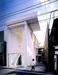
aspect of design, which is making design choices and approaches based on the function of the space as well as the existing condition of the site and the architecture itself. This space, in particular, functions as a restaurant space of a local neighborhood located in a tight, narrow site between two buildings. In this very limited space, the designer took advantage of the rectangular shape of the floor plan to configure the composition of the space.  Circulation is achieved in a linear rhythm and direct manner. Streamlined furniture is kept to a minimum and arranged along the wall and columns, which provides a circulation path in between that assists visitors to their seats and allows employees to easily travel from and to the kitchen/bar area in the back. An open facade that connects the space with a small terrace creates additional circulation paths to the space. Visitors can leave the restaurant space without interrupting the circulation path between the dining tables. The open facade rises continuously to the third floor and integrates the open terrace with the interior space. This facade brings light and an open feeling into the space and turns the entire three floors into one interior unit, which enlarges the space even further. Despite the small square footage, this space exudes an open and airy vibe since the designer chose an achromatic color-scheme with white dominating and expanding the space and accents of black to bring contrast to the architecture and define the furniture. In addition, white curtains enclose the entire space and enhance that light and airy feel into a more dramatic effect. Small lighting fixtures are installed throughout to illuminate the restaurant at night without overwhelming the space. Meanwhile, the bamboo wall/fence not only defines a boundary with the adjacent building and provides privacy, but its natural qualities also bring a sense of nature into this industrial-looking space.

Do you think the designer successfully executed his goal on defining circulation and achieving openness in this limited space? If not, what are the features in the space that needs to be altered or even eliminated to reach that goal? What do you think is the main emphasis in this space that draws the visitors to stop and walk in? Would the space carry a different effect if color were added?  

Image Source: 
Jodidio, Philip. Architecture Now! 3. "Shigeru Ban: Glass Shutter House." Cologne, Germany: Taschen, 2008.

Monday, February 23, 2009

2/23 COMPOSITIONAL

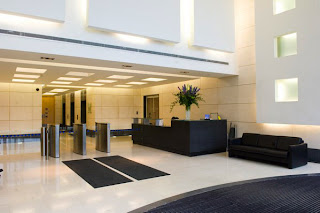
The composition of this space is incredibly unified. The use of both color and shape come together to create a space in which all elements work together. The space demonstrates a strong combination of monumental and human scale. Upon entering the main lobby area, the space is large and open, with a very high ceiling. The monumentality of this initial impression works well as a demonstration of the grandeur of the space. On the other hand, the smaller scale of the reception and elevator areas gives a little more intimate appeal, more fitting to the human interaction within the space. Despite the vast difference in scale, the two areas work well together and the transition from one to the other is quite smooth. This cohesiveness of composition is facilitated by the similarities in color, shape, and form within the space. Rectangular shapes and forms are carried from the initial composition of the floor plan to the three dimensional details of the space. The rectilinear patterns, designs, cutouts, carpeting, and lighting on the wall and ceiling easily emulate the space’s layout. Likewise, the entire area is grounded by the strong forms of the sofa and counter. The harsh contrast between the light white/cream walls and the dark accents of the furniture and floor pattern also creates unity between the two scales while bringing more visual interest to the entire composition.
What would happen if more color were used within the entire space, instead of just as accents? Would darkening the architecture within the space create a different effect? Would the use of more curvilinear forms for the furniture and accents create a more interesting contrast within the composition, or would it merely make for an inconsistent space? Please explain your answers.

02/23: BEHAVORIAL/SYMBOLIC


We all have a general idea of how we should behave in a church or other religious areas. However, I’m sure many people have never considered how certain aspects or characteristics of a church provide us with clues as to how we‘re to act in that space.

The image on the right is a view of the nave in the Amiens Cathedral. Built between 1220 and 1270, the Amiens Cathedral “is considered one of the three masterpieces of the French High Gothic” (Abercrombie, 146). The Amiens is known for its sheer size, which is one of the prominent aspects of the space that tells people how to behave. “The nave is 40 feet wide, an impressive 470 feet long, and an even more impressive 140 feet high…[which is] as tall as a modern fourteen-story office building” (Abercrombie, 147). The main function of the Amiens Cathedral was to serve as a place to worship and praise God and to atone for sins. The design and grand scale of the Cathedral reflects God - strong, powerful, and larger-than life. Thus, the occupants of the space were supposed to feel small and inferior in comparison. The scale of Amiens was purposefully used to make the occupants feel as if they were in a sacred space, separated from the rest of the world, where they could focus solely on God and his importance.


Natural light was also incorporated into the space to remind its occupants of God. Natural light back in the 13th century was very symbolic of the unintelligible Light, or God in His transcendent glory (Auentios, 4). Natural light filled Amiens from every angle, which made the light, or God, almost impossible to ignore.

The vaulted ceiling also played a key role in effecting peoples’ behaviors. Vaulted ceilings were commonly used in Gothic cathedrals to provide adequate acoustics. Amiens Cathedral is very large and could hold many people, which made it important for everyone to be able to hear the priest, the choir, etc. However, better acoustics also meant that the faintest sounds or noises would be picked up and heard throughout the space. The acoustics restricted people from becoming too loud or creating too much noise; people were to sit calmly and quietly, which corresponds with the main function of Amiens Cathedral: to reflect on God.

How would you feel if you were to worship in the Amiens Cathedral? Would you feel comfortable? Would the size and scale of the Cathedral overwhelm you?


(The first image can be found in Abercombie’s book. And the second image can be found at this website http://history.hanover.edu/courses/art/amienn.jpg)

Abercombie, Stanley and Sherrill Whiton. Interior Design and Decoration. 6th ed. Upper Saddle River: Pearson Education, 2007.

Auentios. “The Humanist Quest for a Unity of Knowledge and the Orthodox Metaphysics of Light.”
.

2/23-BEHAVORIAL RESTAURANTS

If you have ever been into a sit-down restaurant, the basic layout of the space is not difficult to comprehend. The multi-functional spaces are broken up into three major components: the kitchen, where the servers and cooks prepare the meals; the seating/dining area, where guests enjoy their meals; and the lobby/host stand, where guests are initially greeted and either await their meals or are ushered to their table. If you have ever worked in a restaurant you will understand the significance of this breakdown, and the further breakdown of the space into sub-categories which serve to make the transition from the lobby to the table, and the kitchen to the table much smoother. When the design of the space is confusing or unorganized, guests and employees have a harder time with the behavioral aspects within the space.
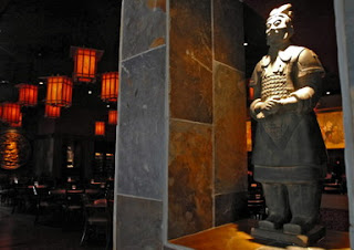
Take for example PF Changs; before even entering the space, guests are clearly directed by the monumentality of the two traditional terracotta soldiers which boldly and daringly encourage traffic to enter the double doors which they are guarding. Upon entering the space, one is greeted by a massive, black, rectangular host stand which is emphasized by the subtle dim lighting. This sets the tone for the meal to be bold and strong, while being a little exotic and unreachable. This serves two purposes: being placed front and center in the entrance, guests are clearly understand where they are supposed to go for service; this also helps the restaurant employees to organize where masses of people stand, so they are not lost within the restaurant or lost to other restaurants. Comfortable seating near the entrance also keeps guests comfortable, allowing them to lounge in the space in the event they have to wait for their table to be ready.


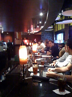
Once in their respective tables, guests have individual lighting sources which are dim and promote intimacy. The specific lighting chosen by the designer for the space serves more than one purpose as well: while it helps guests to feel like their very public dining experience has become more personal because they cannot see other guests as well, it also encourages softer voices. With so many people coming together in a large open space, the multitude of voices could become “noise” rather than “sound.“
This concept is driven also by the various other design decisions. For example, the color scheme, which primarily uses an achromatic interior, with very few accents of red to accentuate the oriental inspiration. Dark, warm woods with heavy lacquer shine within the space letting the deep blue lights reflect off of them. This is starkly contrasted with the heavily textured rock walls in the space, which create depth and interest.


On the opposite end of the spectrum, the kitchen is bright with no space for lounging, but rather wide walkways to allow servers to hurry through the space. The kitchen is white and sanitary, making it easier to both clean and detect when things have become dirty. This makes cleanup easier for employees. Wide passageways around the tables also permit easy flow of traffic through spaces for servers to quickly tend to their tables without disturbing others.

Overall, I think it can be said that well designed restaurants leave enough space for guests to be comfortable while also making the job of the employees easier. When they are not designed under this format, guests can be left feeling uneasy and not wanting to return.
Have you ever worked in a restaurant? What worked and what didn't work? In some of the restaurants you have been in, what encouraged you to stay, and about the space potentially made you want to leave? Where there things that made you feel more comfortable or less comfortable, either as a server or as a customer?

Sunday, February 22, 2009

02/23:PREFERENTIAL


There are many ways to analyze an interior space. One of those ways is preferential. Preferential relates to what preferences are discernable within a space and are they appropriate or inappropriate. The designer of this space has a strong preference for a playful/childish design. The design is based around a child’s mind, with many different shapes and colors, and the openness of space to run. In this design, the designer uses mostly primary color but also a full spectrum of color. At first it is hard to distinguish a focal point with all the different colors, but after a second for your eyes to adjust you begin to notice the bold red wall and tall yellow column anchoring the desk. The red wall, yellow column, and the blue triangle on the desk create a point for people to come to, or in this case a front desk in a lobby of a children’s hospital. The pendant lighting also helps to create this focal point. The materials chosen for this space are appropriate for the function of the space because they are materials that are easy to clean and help with the safety of children. An example would be the glass in and above the stair rail. This not only lets the design shine through but also prevents children from climbing over. The color scheme chosen enhances the design and is appropriate. The color gives a claiming feeling to a child, making the hospital almost feel like a playground or play center (which is what I thought when first seeing the picture). The shapes of the desk, seating and artwork are also very playful. The space is very modern and open but what do you feel about this space? Do you feel the design is functional? How do you think the space would be affected if it was not so open or had more seating?

Image source and more images of interior:www.granaryassoc.com/index.asp?M04_P014

2/23 - SYMBOLIC, McDonald's

McDonald's

McDonalds’ is the most famous American chain of fast food restaurants in the world. Located in almost every country in the world, the McDonald’s Corporation owns a monopoly in hamburgers sales. Its Golden Arches have become a status symbol of America and everyone associates this logo to the name, food and service. A customer knows that, when he sees the golden arches tower over the sky, he is going to get a fast service and an exclusive selection of food that he can only find there.
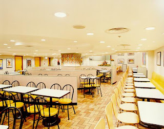
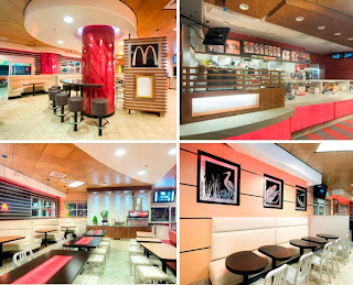
The interior space resembles the logo – yellow and red are the primary colors used in the restaurant and serve to remind the users about what they are getting from this place. A bright and well lit space is essential for the corporation. By using very vivid colors – yellow and red – in a very achromatic space – white walls and black furnishing – the McDonald’s Company makes its customers know about their business philosophy. Customers are unconsciously induced to walk in, eat and walk out. The key words of this space are fast, business, money. People do not expect much from this space either – they know they are in the restaurant for business only.
When entering the space, customers are stimulated to walk straight to the counter. The large, bright food panels are the focus of the space and are emphasized by the straight line quality of the tiles on the floor that walk customers directly to the ordering point. Once there, they order their food and move aside to let the customers behind them place their purchase. Once again, the space encourages users to move fast and act business like. The area is not meant for the customers to linger, but it rather makes them leave after their purchase.
The music is kept at a medium to low level, and it is usually fast paced music. This device is used together with the vivid colors and bright light to keep the customers active and animated. Unlike at Starbucks, for example, where people are invited to stay by the soft light and comfortable space, at McDonald’s customers are meant to be kept “awake” and dynamic, so that they leave soon. McDonald’s is known after all for making money when its customers buy, rather than hanging out in the restaurant in a laid back mood.
Do you think that the space is appropriate for the philosophy of the Company? How do you feel when you use this space? Pressured to leave? Uncomfortable? Do you believe the symbols employed in the space work well? How so?

(2/23) Pragmatic


In our various interior design classes we have learned to analyze different spaces. One way we do this is by searching for the reasons behind specific design decisions made according to the functionality of the space. This particular space is considered a multifunctional space. It serves as an entertainment and dining area. The structural column with the sconce serves as a divider of the spaces, while still keeping an open plan. The artificial plant placed, in front of the column, spreads its leaves in an attempt to combine the separate functional spaces into one open plan. The elongated piece of art in the dining space makes the area feel taller, and more open and airy because of the verticality. The sleekness of the dining chair backs mimics this verticality. The entire dining set is a modern sleek look, designed to open up the space so it appears larger than it is in reality.


Pragmatically, the circulation of the space is clean and defined. The living room area is more open allowing for more space for people to congregate and move about the space. The lighting above the living area and television stand divides the space horizontally to break up the verticality of the column and make the space more intimate. This will make the visitors of the space feel more comfortable because of the intimacy feeling created by the lighting. A rug was placed in the most travelled part of each space to help absorb sound. However, there is not anything else in the space to help break up the sound. From this information I can concur that the owner’s of this space do not care if the space gets loud at times.

Who do you think the space was designed for? As interior designers, we have developed the ability to be efficient problem solvers. Are there any elements in this space you would change?