
Monday, April 27, 2009
4/27 Symbolic
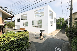


Though at first thought, symbolism seems to apply to churches and places of importance; however, I have chosen to analyze a home in regards to symbolism. The N House is a set of three nesting boxes that have specifically located wholes. This house is in Japan’s southern island Kyushu and was designed by Sou Fujimoto. The concept for this space was focus on the idea of implication and symbolism, rather than harsh definition. Instead of sharply dividing private and public domains, the white shells contain a gradual transition to more intimate spaces. It was also important to balance the solid surfaces and large openings, making sure there was enough protection. The shell incorporates an exterior space which continues to ambiguously define the house and the street. The biggest shelter is an L shape and measures to 1,895 square feet. The middle box covers a donut-shape space with the entry foyer at the front and measures 635 square feet. The final box serves as living and dining area and measures to 195 square feet. What makes this space so unique are the 44 rectangles cut from its three shells. When considering the position of the openings, the sun as well as the sight of line guided their locations. When looking at this house, it is hard to focus and clearly define specific areas. Instead the architect stressed the importance of implication and symbolism. Rather than being told exactly how to function and interact with the space, there are the suggestions of special divisions, making the space a unique experience.
Within your own home, apartment or dorm, what are symbols that this house does not have? Do you feel that it would be difficult to function efficiently within this space? Other homes such as the Farnsworth house have pushed the ideas and symbolism of the typical household. Do you think this will trickle down and inspire the mass produced homes, or do you think most homes in America will continue to look like a suburban cookie-cutter?
Within your own home, apartment or dorm, what are symbols that this house does not have? Do you feel that it would be difficult to function efficiently within this space? Other homes such as the Farnsworth house have pushed the ideas and symbolism of the typical household. Do you think this will trickle down and inspire the mass produced homes, or do you think most homes in America will continue to look like a suburban cookie-cutter?
Sunday, April 26, 2009
Compositional


When I thought about a space that would be easily analyzed compositionally, I thought about theaters. When I saw the Sydney Opera House I knew it was an amazing space and I had seen it before, but the interiors are so complex and the design is very interesting. The Opera House as anyone would expect is on a monumental scale. A human would feel completely insignificant in the space. The exterior of the building itself demands attention, but upon entering the space one is overwhelmed with a sense of awe. The geometric shapes that form the shell of the building are repeated within the interiors to create a connection. The composition of the space delegates how people interact and view the space.
The main purpose of the space is to provide an area to view theatrical performances. The designer intentionally arranged the seating in ways which allowed the show to be viewed from multiple sides. All two and three dimensional aspects of the space are rectilinear and have a central emphasis on the stage. Your eye can follow any line in the space to that central focus and the reason why everyone is there. This sectioning of seating and strong use of line creates isles and forms specific traffic patterns through the space.
Although the building itself has one specific purpose, there are individual spaces (mostly the separate seating areas) that are all similarly proportioned. The largest areas though are the stage and the massive step seating area directly in front of the stage. The designer did a very good job of relating the floor plan to the three dimensionality of the space. When I look at the interior of the Sydney Opera House, it reminds me of a symphony. I am not exactly sure of the designer’s intent here, but it feels as though it embodies what an opera house should be. When you see these pictures how do you think the space would make you feel? Do you feel as though the designer did a good job of relating both the two and three dimensionality of the space? How do you think the designer wants an person to feel in this space?
4/27 Pragmatic

As design students we can vouch that it is important to have ad
equate space for designing as well as an adequate creative environment. When renovating the Slocum Hall, home to the Syracuse University School of Architecture, a variety of specifications needed to be taken into consideration in order to successfully revamp the space.
Garrison Architects looked into a variety of issues, specific areas for pin ups, open atmosphere, architectural interest, as well as green design. During the renovation of Slocum Garrison discovered a lot about the building. Over th

e years it had been divided and adapted to house a growing number of students and faculty. By doing so a lot of the “interior details were lost; partitions were added; the central atrium was filled in. Time and again, immediate spatial needs demanded the sacrifice of airflow and
natural light” (Brake). During the renovation Garrison opened the space exposing again the atrium, allowing natural light and proper airflow to enter the space. This can become important when there is a large occupancy so that the room temperature stays comfortable, further helps to provide a creative atmosphere. Garrison designed the space so that activity would radiate outward from a central atrium, providing a common area space. Adequate space for student pin ups was a major issue in our own building Funkhouser Garrison addressed this common issue by providing a “double-height gallery for student displays and touring exhibitions” (Brake).

He also hung panels made of recycled paper for more pinup surfaces in common areas. All of the redesigning was done using green materials.
Based on the Renovation of Slocum, how many buildings do you think have underlying layers that actually work for the space? Where through time we have distorted it’s original logical design. Garrison stated that “things have a way of coming back around.” Would you agree with his statement? If so in what ways do you see design turning back around?
4/27-WILD CARD-Behavioral


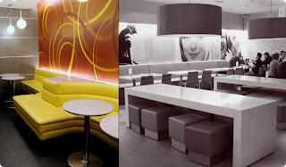
 Designing to influence how people interact within a space is extremely important, especially when people must work together. Many companies are beginning to design corporate offices that will enhance positive behaviors or attitudes of employees and help them to embody company values. One example of this at the Yahoo! corporate office in Switzerland. Being a more free-thinking, open-minded, and casual place to work, they have developed an office that strongly supports these characteristics. As shown in the pictures above, most of the meeting areas within the space have been designed and decorated to resemble outdoor settings, including a rocky waterfront, a dairy farm pasture, and the exterior of a log cabin. They not only have seating that follows these themes, but also have murals depicting sprawling natural environments adorning the walls. Natural environments have been proven to support productivity and help to boost the morale and positive attitudes, so this could be very important in helping Yahoo! employees work together. The casual spaces supportive of productivity and optimism inspires workers to think more freely and openly collaborate with one another to get things accomplished. It not only inspires creativity, but also influences their creative minds. A fun, interactive, and informal environment like this is much more conducive to the creative process than a formal, more sterile office setting.
What are some other companies that have used this tactic? How could a work environment that is much more structured and strict be conveyed through the interior design? Which type of work environment could you see yourself working in and why?
4/27 - PREFERENTIAL
In order to create the best design possible, designers must always be conscious of the decisions that they make within a space. Elements of the space, such as the lighting, the setting, and/or the function, may dictate how the designer proceeds with their design.
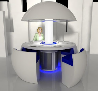
Turkish designer, Fatih Can Sariöz had to consider these same elements when he designed the “Kure” pod. The “Kure” pod is a futuristic idea for a modern dining table and/or sitting area. Sariöz believed that quality time with the family has diminished in the past generation and was thus motivated to create a table that would bring everyone closer together (“Kure”). Sariöz’s desire to bring people closer was accomplished through the shape of the table. The round, circular design of the “Kure” creates a more intimate space and encourages more face-to-face conversation. Sariöz also strived to create an atmosphere appropriate for family and friend gatherings. People tend to be most as ease when they’re with family and friends. With this in mind, Sariöz decided to add a touch of blue to his design in order to create a fun and relaxed atmosphere in which people felt comfort to interact. The lighting used in the “Kure” pod also helps to create this atmosphere. The central tube, which supports the roof-like component, provides strong, general lighting around the center of the table. The recessed lights within the roof component are a little softer, but help add more light around the edge of the table where people are sitting. This strong, central lighting also creates a more intimate space.
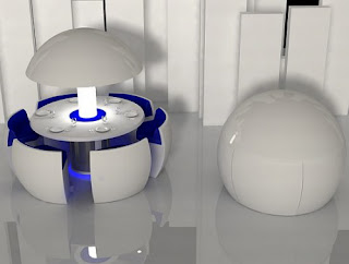
When designing the “Kure,” Sarıöz also considered how many people these days desire more space within their homes. Thus, the “Kure” pod was designed to close into a spherical shape, which conceals the six chairs and table (“Kure”).
How successful do you feel Fatih Can Sarıöz was at creating an intimate dining table? How do you think the design could be improved? Do you think this design is feasible, or is it too futuristic?
“Kure: The Modern Round Dining Table and Chairs in a ‘Pod’.” Furniture and Fashion. 2009.
.

Turkish designer, Fatih Can Sariöz had to consider these same elements when he designed the “Kure” pod. The “Kure” pod is a futuristic idea for a modern dining table and/or sitting area. Sariöz believed that quality time with the family has diminished in the past generation and was thus motivated to create a table that would bring everyone closer together (“Kure”). Sariöz’s desire to bring people closer was accomplished through the shape of the table. The round, circular design of the “Kure” creates a more intimate space and encourages more face-to-face conversation. Sariöz also strived to create an atmosphere appropriate for family and friend gatherings. People tend to be most as ease when they’re with family and friends. With this in mind, Sariöz decided to add a touch of blue to his design in order to create a fun and relaxed atmosphere in which people felt comfort to interact. The lighting used in the “Kure” pod also helps to create this atmosphere. The central tube, which supports the roof-like component, provides strong, general lighting around the center of the table. The recessed lights within the roof component are a little softer, but help add more light around the edge of the table where people are sitting. This strong, central lighting also creates a more intimate space.

When designing the “Kure,” Sarıöz also considered how many people these days desire more space within their homes. Thus, the “Kure” pod was designed to close into a spherical shape, which conceals the six chairs and table (“Kure”).
How successful do you feel Fatih Can Sarıöz was at creating an intimate dining table? How do you think the design could be improved? Do you think this design is feasible, or is it too futuristic?
“Kure: The Modern Round Dining Table and Chairs in a ‘Pod’.” Furniture and Fashion. 2009.
Saturday, April 25, 2009
4/27 - Behavioral

With parents said to be lashing out a cool $1 billion a year on kids birthday parties, its easy to see that the kids’ party industry is a gold mine. As children's taste develop, so too does their demand for the latest and greatest (think Veruca Salt in Willy Wonka). For some parents, the age old sleep over is being replaced by a girls night out at Alton Towers Hotel in the U.K.
The hotel has it's own children's Sleep over Suite, a theme room which caters for up to six sleeping princesses who can indulge in the ultimate girls slumber party. This space allows girls to behave like girls. The sound proof room is perfect for 3am giggling fits and Justin Timberlake blearing throughout the night.
The suite is divided into two areas. The party area features an over the top entertainment system, karaoke, mini dance floor and a pink fridge filled with ice cream. The sleeping area boasts chill out beds which connect into one big bed for six occupants, a wall to wall mirrored bathroom which is flowing with pampering products from U.K's leading brands. (limitless branding opportunities here).
At $560 per night, mom and dad have outsourced the kids’ birthday party and only have to worry about the drop off and pick up. The hotel allows girls to be girls, no matter what the age. The preferences of the designer has made these hotel rooms into princess palaces. The pinks and purples, products, and fixtures give the girls permission to be themselves. They don’t have to act sophisticated or reserved, but they can be noisy and spontaneous in this space.
Do you feel that you could connect with your inner girl in this space? Do you think that older females would enjoy this space as well as younger girls? Would you consider this hotel for a bachelorette party, birthday party or girls night out party? What changes, if any, would you make to have this hotel room better fit your needs?
Monday, April 20, 2009
4/20-Pragmatic


This building, an exhibition hall in Madison, Wisconsin called the Alliant Energy Center, has been successfully designed from a pragmatic standpoint. Because they house such a variety of events, exhibition halls must be able to adapt to many different users from a multitude of backgrounds, and they often house an extremely large number of visitors for any given event. In this case, the neutral grey tones of the entire space lend themselves well to adaptation for different events, as the grey can bridge the gaps that bolder colors may not be able to. Although the color scheme is more achromatic, the wide range of shades used help to delineate spaces within the building and add interest. Also, the use of large walls of windows brings in more natural light to soften the space, which could otherwise be considered very sterile. Extremely wide walkways leading to hall entrances can accomodate the large number of users moving in and out of the space to avoid traffic jams. This keeps circulation within the space moving freely. Next, each entrance to a hall is marked by a protruding sign that can be changed to display the event which is being held inside. This signage helps to guide visitors to their destinations. Another object used for wayfinding is the large cylinder stationed above the main staircase. This creates a strong focal point within the space and draws the visitors toward it. It makes access to the next level easy to find, and also provides a strong landmark within the large, open area. Benches along the walls provide resting place for visitors who have been on their feet for an extended time, or who are waiting to meet someone. Overall, the lobby space is very accomodating and easy to read.
Next, the interior of each hall within the space is extremely plain when not in use. It was successfully designed this way in order to allow for the customization for the different events held in the space. Designed in such a way, with bright even lighting, it can be completely transfromed for the events held there. This can be seen in the two examples below, one of a banquet, the other of a Garden Expo.


Based on the design of this exhibition hall and how it can adapt to a variety of users, can you think of any other buildings that must demonstrate a great deal of versatility within their design? What are some other ways that this versatility can be acheived? In your opinion, onsidering such varying uses for the building, would the addition of color detract from the design? Please explain.


4 > 20 > BEHAVIORAL
 In 2005, the Indonesian Island, Nias was struck by a combination tsunami and earthquake. The disaster killed hundreds and destroying 90% of what little built structures they had. Thousands of islanders were displaced and children were orphaned. In 2007, the Catholic relief organization Caritas Osterreich, and the design team from the school of Architecture at Vienna University of Technology in Austria, teamed up to create a recreation center for these orphans. It was built May 2007 on the northeast coast of the island and was titled “Nias Design-Build Project.” For eight weeks, the team worked with the local people and became a part of their community
The team was presented with the task of creating a 2,000-square foot hall which would accommodate the children’s various recreational interests while serving as a meeting and dining place while remaining playfully dynamic and physically transformative. And all of which was to be done within a strict 58,000 budget on a difficult topographical landscape.
 Through the use of sliding doors and folding walls, the building was segmented yet gave the flexibility to become an open plan. Running through the body of the building is a long atrium which follows the downward slope of the rocky hill it sits upon. This atrium acts as a communal sitting and play area, auditorium, and stairway while also providing a circulation of air to keep the children comfortable while playing. At the lowest point of the atrium is the music room which can be opened up to the surrounding area, extending the space further for use during theatrical productions. Located at the very top of the atrium is the library which can be opened up to look down upon the music room, lending itself to additional seating, as well as air circulation.
 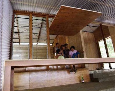 The entire space is taken advantage of with ladders, nooks, and jumping areas. The entire space is turned into a play area, rather than creating a separate play room. In this way, it was possible to actually make the play room larger rather than having to squeeze it into some smaller available space. Also, this encourages these burdened children to incorporate fun and optimism into everyday activities rather than setting it aside for a different time. This project acts as a symbol of a hopeful future for the children and entire community of the Nias Island survivors.
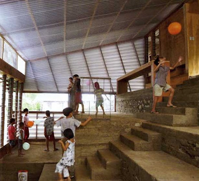 Do you think some clients are in greater need of design than others? As a designer, do you feel that some projects are more valuable than others? Can you think of any other examples of designs which have played such a strong role in the development of a community, perhaps someplace closer to home?
Preferential
Preferential designs are based on the preferences of the designer and how they decide to implement and express that into their design. Even though this is the designer’s choice, it’s still important to create an appropriate design.
Arthur Casas placed his own House in Iporanga deep in the Atlantic forest, the ideal Brazilian landscape for himself. This allowed the architect to have the ultimate expression of his relationship to the surrounding world through the blank canvas he was able to create a home from in the forest.
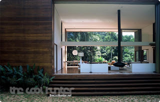
Two symmetrical rectangular cubes face one another on the north and south sides of the area. They are connected by two retractable 36 foot-high glass walls which frame the main living and dining areas of the house. The exterior of the house is paneled in Cumaru wood which blends into the surrounding landscape. The Cumaru wood is also used inside as flooring. This contrasts against the stark white walls. The white used in the walls is the only “color” seen in the minimalist space.
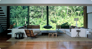
Casas divided the ground floor into distinct public and private areas. The entire space is connected by the vast living room flanked by wood terraces on both ends. There is a floating Cumaru stairway leading to the first level. A narrow bridge crosses over the middle of the living room and leads into the north side of the space.
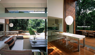
The main objective of Casas’s design was to provide an escape into the Brazilian forest for himself. He has accomplished the creation of a personal retreat, a place where he is able to relax and recharge, through his own personal design decisions.
Even though Casa’s designed a personal escape for himself would you find yourself feeling just as relaxed and comfortable within the space? Do the modern, sleek design elements (i.e. the horizontal straight lines) contrast too much with the surrounding relaxed landscape? Would you feel too exposed and vulnerable with so much glass surrounding you in the space?
Sunday, April 19, 2009
4/20: Wild Card, Behavioral

Lately the design world has been discussing the use of branding to create an experience. Many companies use branding to create a uniform experience in their stores. How does branding affect behavior? Branding is a company's way of telling you how to interact with the product, space, etc. Branding can be found everywhere from packaging of products, retail design, to what we as humans wear.

Aesop is an up and coming skincare line based in Australia. Besides having great products, part of their appeal is the store design. Each store has its own design. This keeps customers coming because they want to see what a new store will be like. The modern design of the retail spaces gives the products a high end feel. Customers are more likely to pay extra money because of the surroundings. This was in the forefront of the design, to create a space that makes the product stand out and give the product more value.

Though Aesop has a different design for each of its stores, the company has some commonalities in each of its designs. Those commonalities are the use of water, modern design and streamlining the space. Another driving principle is Aesop design is sustainability. Each of the stores is designed in relation to its location, which adds to the ambiance. Another idea that is translated throughout all the stores is the idea of customer interaction. The spaces are designed so that customers can browse, pick up products and therefore be more likely to purchase.

Do you think that Aesop's brand influence behavior in their stores. Does the idea of each store having its own design work or is it to hard to connect back to the brand? Would you be more likely to purchase something from this type of store or the cookie-cutter stores like Sephora?
All images come from The Cool Hunter:http://www.thecoolhunter.net/stores/
Symbolic 4/20

Symbolism has been used in architecture and interior design for years. It is a way to make the viewer really connect with the environment they are in. In this case the architecture is designed to symbolize adolescence and childhood. Growing up as a child I can recall they days when I would climb up into my tree house and simply get away for a while. Almost every person can recall memories like this or to something of this nature. Children love to climb things and be adventurous. These pieces of architecture are merely grown up versions of tree houses. A German company called Baumraum designs and builds theses solid tree houses out of all natural materials. Each one is individually designed based on the wants of the client and the preexisting layout of the land.

They can be constructed from practically any wood type and can be places people can virtually live in. The treespaces walls are insulated giving ultimate protection for the outdoor climate. “They can be outfitted with sitting and sleeping benches, storage spaces, a mini-kitchen, heating, glass windows, lighting, as well as a sound system for multimedia” (www.thecoolhunter.net). The houses are even eco-friendly since they are attached with ropes minimizing the impact of stress on the trees it sits on. They truly are tree houses designed with an older market in mind.

“As we get older, the urge to climb trees subsides as we ride elevators up to our offices in the sky and look out across the cities where we live” (www.thecoolhunter.net). Even though these urges go away it is still nice to come back and visit the pleasant memories of our youth. In truth it all symbolizes humans wants to be kids again. Children do not have to deal with all the pressure of adult life. They go to school, eat a snack, and go play outside. We want to return to those memories and think about them ever so often. These houses truly are a place people can go to “climb trees again.”
Do you believe this space could make you feel like a kid again? If so how?
It is almost to childlike is some aspects?
How could these treespaces be appeal even more to an adult audience?
COMPOSITIONAL 4/20


One of the purposes of analyzing design in a compositional way is to see how the designer applied two- and three-dimensional composition within the space and if the two-dimensional compositional floor plan relates to the three-dimensional composition of the space. When doing this one can look at the proportions of the space by asking is the space human or monumental scale and what are the proportions of the individual spaces. The above images were taken in the head office of the fashion house Escada in Munich, Germany. When looking at these images one can see that the two-dimensional floor plan is long and rectilinear. The lines in the flooring material as well as the horizontal lighting in the ceiling help to exaggerate the length and make the building seem longer and narrower. Also, the use of short, elongated furniture mimics the layout of the building. The staircase is another three-dimensional architectural unit that creates a dynamic effect in relation to the two-dimensional floor plan. It stretches over a long span of space and each stair plane is extended creating layers of horizontal lines. Overall, these elements are manipulating the space in a way that exaggerates the length and width. In the same way the height of the building is also being manipulated through vertical lines. The ceiling heights vary in different locations of the building but most of them look to be at human scale. Through the use of vertical line in the wall material an illusion is created that the ceiling’s height is taller than it actually is.
If the building didn’t use vertical lines to exaggerate the height how would the three-dimensional composition of the space look? What would happen if curvilinear lines were added to the space? Do you think that this space has a successful relation between the two-dimensional and the three-dimensional composition?
Monday, April 13, 2009
4/13/09 Pragmatic
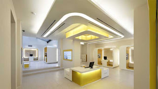

It is interesting to think how many different buildings we can design and change; however sometimes banks are often forgotten. One main cause for this is the increase in online banking, making the bank itself less important to the average person. If however you are forced to visit a bank, it is not the most exciting experience; rather they are boring and conventional. Since this decrease in bank designs, many designers are pushing for new concepts concerning the interiors of banks. The image above is of the CheBanca in Milan designed by Crea International. The design reflects the company’s simplistic, clear, and innovative approach toward banking. The goal of the project was to bring life and spirit to the company as well as focus on the essentials.
The space itself, through a pragmatic sense, is very successful. The central focus is straight to the main desk. This is accomplished through not only its location, but also the focus created through the ceiling plan. The lighting in the space also adds to the overall sense of place. It opens the space with its brightness. The lighting is also complimented by the use of yellow. The color yellow is not aggressive, but rather exciting and energetic. The traffic pattern is clear as well. The path of travel is clear and unobstructed, and is also assisted by the use of yellow as visual way. Overall the pragmatics of the space have been thoroughly thought out and effectively addressed.
By looking at a space such as this bank, what other buildings in your opinion have become forgotten? What ways can they be rethought or redesigned? Why have they become less important, or why have they always been less important? If you could pick a type of building to rethink what would it be and how would you address it?
4/13 Compositional

The following composition of this particular space is very specific and deliberate. The three dimensional elements of the space are curvilinear, like the circle created along the wall, and are repeated with the overhanging ceiling, as well as with the large seating area. This repeated shape allows for organization and precise traffic patterns, which are important in a work environmental and allow for less distraction. Furthermore, the scale of the space is quite large, giving the interior a feeling of importance, which overall suits the space due to the official activity happening within it.
However, with its monumental quality, all the aspects of the space are rather proportional. The wall, the main focal point of the room, is extremely large. But with the large wall follows the large seating arrangements which have been constructed to repeat the shape, as well as the size of the screen. Therefore, although the wall may seem proportionally large, the rest of the space has been altered so that a certain balance is created in the room.
Compositionally, the space is very rounded. The repetition of a constant curvilinear form creates order in the space. Furthermore, with each repeated form, a new area is designated, like the center lighting area constructed by the use of another circular shape. This separation of spaces allows for optimum function and order.
Compositionally, what is the most successful element of the space?
Compositionally, what is the least successful element of the space?
If another repeated shape was used, would the space be as successful?
Sunday, April 12, 2009
Wild Card (Preferential)-4/13
 Something that one can find on almost every corner across six continents creates a “familiar home” with a never ending sense of welcoming. Their iconic golden arches create the most recognizable burger chain on Earth. This place is known as no other than McDonalds. The world has been depending on McDonalds for that irreplaceable, quick meal for over half a century.
McDonald's is the leading global foodservice retailer with more than 31,000 local restaurants serving more than 58 million people in 118 countries each day.  Although McDonalds is known as one of the most recognizable brands on earth, change is still inevitable. As we have become more health conscious, McDonalds has responded with a wide variety of salads and fruits to choose from. As the world has become more internationally minded, so has McDonalds. In Norway, they serve the grilled salmon McLak, and Japan serves green tea-flavored milkshakes. And finally, as the world has become more design conscious, once again McDonalds has as well. The recurring use of hard immoveable chairs and tables create the ultimate essence of the pure function of McDonalds. This function creates a place where customers are in and out quickly without lingering or lounging. The sole purpose of the interior is to have a quick meal and leave, unlike places like star bucks, where they offer comfortable seating and large tables to spread out on.
McDonalds is constantly recreating its brand in practically every possible way. But today, some of their restaurants are becoming more and more comfortable. Seating is softer, and the restaurants have developed different territories which create different functions. Through these new designs, conversation is encouraged, as well as comfort.
Although McDonalds is known as one of the most recognizable brands on earth, change is still inevitable. As we have become more health conscious, McDonalds has responded with a wide variety of salads and fruits to choose from. As the world has become more internationally minded, so has McDonalds. In Norway, they serve the grilled salmon McLak, and Japan serves green tea-flavored milkshakes. And finally, as the world has become more design conscious, once again McDonalds has as well. The recurring use of hard immoveable chairs and tables create the ultimate essence of the pure function of McDonalds. This function creates a place where customers are in and out quickly without lingering or lounging. The sole purpose of the interior is to have a quick meal and leave, unlike places like star bucks, where they offer comfortable seating and large tables to spread out on.McDonalds is constantly recreating its brand in practically every possible way. But today, some of their restaurants are becoming more and more comfortable. Seating is softer, and the restaurants have developed different territories which create different functions. Through these new designs, conversation is encouraged, as well as comfort.
 Although McDonald’s golden arches will most likely never die, its interiors and menus are constantly changing. How do you think in the future McDonalds will continue to alter its brand? Since the menu is taking turns in the direction of a café, do you think that it will develop into something similar to Star Bucks, where lounging and conversation is encouraged? Where do you think that the line should be drawn to where McDonalds original intended brand isn’t completely transformed? Please explain your answers.
4/12--PREFERENTIAL

Preferential design decisions are based on preferences of designers and how they showcase that within a space. These decisions may be what the designer wants, but what is important is if those designs are appropriate or not for the space. This space is a hotel design for the NYLO Hotel in Plano, Texas. The main design is meant to be an urban, exciting and fun lifestyle experience while on the road. It is meant to be a business hotel that is a bit different. This space shows a contrast and compliment between two different aspects in the area: new technology and affordable upscale hotels. The space itself is a very urban geared design with exposed concrete walls and a lot of tan and beige tones, seen through the wooden chairs’ couches and the upholstered hanging bubble chairs.
The urban influences are very apparent. There is a mixture of curvilinear elements and rectilinear elements that compose the main lobby area. The architectural elements are extremely neutral and rectilinear. The wood elements are used in the bench/sofa seating and bookcases are placed around the perimeter of the room to create a boundary and are the main supply of color.
The curvilinear elements are found in the tables, the light fixtures hanging down from the ceiling, the bubble chairs and the rugs to the right of the reception desk.

They are repetitions of circles within each element. The light grays that they are composed of help to create a soft, soothing interior color scheme. They give the impression of a very upscale, high end hotel, which contrasts what it actually is.
The lighter, softer grays help to add to the lightness of the space, since the majority of the space doesn’t house many lights. On the back wall, there are a couple of windows, and task lighting over the desk, but the majority of the light coming into the space is reflected off of the metal HVAC equipment.
Although the designer wanted to make the space more modern and up-to-date, they chose to use neutral grays and tans. If they had added a bolder color, such as red or orange, do you think that the space would have a different feeling? Do you think that combination of the rectilinear and curvilinear furniture elements work? Would the lobby have a different feeling if everything was rectilinear, like the wooden slat bench, or if the seating was all like the bubble chairs hanging from the ceiling?
Photos from http://www.top-hotels-restaurants.com/2008/07/nylo-hotel-texas/
SYMBOLIC - WHEN A CHURCH BECOMES A NIGHT CLUB
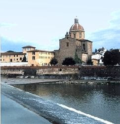 Santa Maria del Carmine in Florence is one of the most known churches of the historical center and it brings thousands of tourists every year to visit the famous Cappella Brancacci.
The Historical Center of Piazza del Carmine counts several churches of different religious cults: Catholic, Protestant and Anglican are some of them.
Recently, the desecrated Anglican Church of Piazza del Carmine has been purchased and renovated by one of the most famous fashion designers of Italy, Roberto Cavalli. From a symbolic perspective, the church itself preserves the typical characteristics of a sacred structure. The façade is tall and looks out on the flat piazza. The Latin Cross layout remains and at the intersection of the transept and main nave the altar is found. During the day, the piazza seems like any other sacred place – quiet and holy. During the night however, this area becomes one of the most crowded of Florence.
 The desecrated Anglican church becomes a night club and all its religious symbolism is taken over by a secular world. The interior is reinvented and the luxurious high ceilings of the main nave are lit by fluorescents lights. The symmetry of the Latin cross layout is maintained, but the benches facing the altar are relocated and moved around to create small lounge areas within the larger nave. The altar itself loses its religious connotation, but preserve all the Christian symbolism. It is still the focus of the space and in fact functions as a deejay station. Music and nightlife become the focus of the space.
 The niches on the side aisles retain their function – they are kept as comfort areas away from the chaotic atmosphere of the night club. The cross vaults are maintained and relate back to the symbolism of the Church.
The pictorial icons of Christ and Saints are replaced by secular posters and photographs. Comfortable chairs are chosen on the place of wooden benches. Smooth and shiny materials contrast the concrete walls of the original structure.
 Overall, the edifice was redesigned to accomodate a different public, but it still preserve the main symbols of a church, although reinvented. Do you think the architect/designer kept in mind the religious symbolism of the structure when remodeling the space? How so? Do you think this is the appropriate space to turn into a nightclub (keep in mind that the church was desecrated for decades and not in use)?
Subscribe to:
Posts (Atom)