Saturday, March 28, 2009

3/30 PRAGMATIC

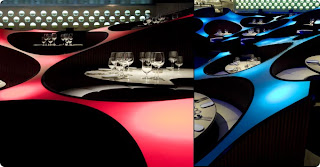
When observing interior spaces one can go about that in a multitude of ways. By using a pragmatic approach one would look at how the design decisions relate to the existing building and the function of that building. Also, the traffic patterns, lighting levels, and noise levels of the design are taken into consideration. In the above images, taken in The Blue Frog Club in Mumbai, we can analyze how the pragmatic factors were incorporated into the design ideas. First of all, we need to analyze the function of the building. The Blue Frog operates as a club, restaurant, lounge, and sound stage, ultimately a place for large groups of people to gather and be entertained. Knowing this we can assume that the building’s noise level is quite high and the typical lighting levels for these places is low. The designers of this space realized this and solved this problem through the unique design of the space. By creating a psychedelic wave like design around the tables the designers created privacy among the parties who will occupy the tables. Although the tables are positioned rather closely, each table is barricaded by a solid wall that serves as the back rest to the tables, creating a more private and intimate design. This design concept also could help with the noise level because each table section is circular therefore all the members of the dinner party are facing each other eliminating people from shouting down the table. Lighting in this space is rather dim with spotlights and colored illumination as accents, setting the mood for the evening. When looking at these pictures you can see that each table is spot lit, also helping give the feeling of privacy. One thing I noticed within this design that might serve as a problem would be traffic patterns. Each traffic pattern to the tables seems unclear and hidden if you didn’t know where you were unfamiliar to the space. Also, from the pictures they don’t seem to be ADA friendly.
From your own observations how do you feel about this space? Do you think it serves it purpose and creates private, intimate sections for each party? If the lighting were brighter how do you think it would affect the space?

http://www.thecoolhunter.net/bars/

Monday, March 23, 2009

3/23 PERFERENTIAL


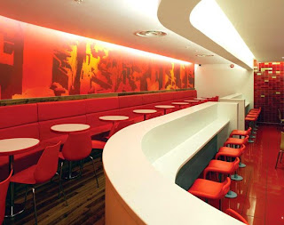
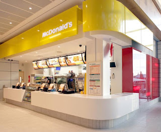
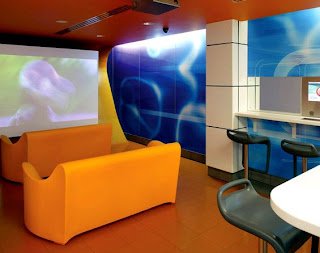
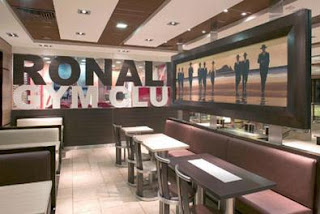
There are many ways to analyze an interior space. One of those ways is preferential. Preferential relates to what preferences are discernable within a space and are they appropriate or inappropriate. The design is based around an identifiable brand, which is the all-famous fast food restaurant, McDonalds. The local yellow arches have received a makeover. In this design, the designer uses mostly the identifiable brand colors of McDonalds that are yellow, red, and white. It is also hard to distinguish a focal point within the space with all the different shades of yellows and reds. The materials chosen for this space are appropriate for the function of the space because they are materials that are easy to clean, although the materials are not what we are used to being in a McDonalds. The materials also are appropriate for updating this European McDonald’s into a chic modern/contemporary fast food restaurant. In the new interior, the typical (and uncomfortable) fixed plastic seating is gone, and instead we’re seeing upholstered banquettes, wood tables, and hanging lamps. They spruced up their entire dining area, creating more of a restaurant, instead of fast food feel. The color scheme chosen enhances the identifiable brand and the design, and is appropriate. We as Americans are so use to seeing the uncomfortable seating and “typical” interior that some of us might feel that the design before us is not functional. Although as time evolves, this new design is becoming the new face for McDonalds and leaving the old one behind. The McDonald’s space is very modern/ contemporary and open but what do you feel about this space? How do you think the space would be affected if it were not so modern/ contemporary? Do you feel the design is functional? Do you think the design should be used in other McDonalds? Like in America?

Image Source: http://www.contemporist.com/2008/09/19/interior-designs-for-mcdonalds-uk-by-shh/

Here are some other images I found of McDonalds! Enjoy!


Sunday, March 22, 2009


The composition of Casa no Geres along the Spanish border in Portugal is very appropriate for its environment. It is located in a National Park where there is beauty all around. The scale of the structure is very appropriate because it allows the building to blend in with the scale of its surrounding environment, which consists of plenty of trees, rock, and water. It was constructed in human scale where everything is on the same level. There are no high vaulted ceiling to make the viewer seem miniscule or anything of that nature. This allows the viewer to connect with the space and feel at home. Even though the space is in human scale, the outside environment around it is a very monumental scale. The sheer size of the 5,000 square meter park surrounding the home is enormous compared to the 60 square meter house.

The 2-D and 3-D composition of the space is very well related to its floor plan. The shapes and forms seen throughout the interior are reflected in the layout. It seems that geometric shapes were primarily used in the space. There was some use of curvilinear forms but not the majority. For example the rectangular windows that surround the home emulate the rectangular layout of the home. There are wood panels that cover the walls and ceiling of the interior also reflect this rectangular shape. There are square and rectangular carpets that fill the space. The parallelogram shapes of the couches reflect the overall shape of the house. Finally the colors used in the interior reflect the natural colors that are seen simply by gazing through the window.

A real sense of cohesiveness is formed by all of these different elements. It is somewhat unlikely considering it is a concrete structure in the middle of the wilderness. But the simplicity of the structure and its straightforward design is mimicked in nature. The wonderful views that are created through the large window openings tie the scene together as a whole.
Would this structure connect to its surroundings even more if its materials were changed? What materials would you suggest to use to accomplish this? Would you feel comfortable and at ease in this environment? Why or why not?

Symbolic: 3/23


Hard Rock Cafe is a symbol for many things all around the world. It stands for All-American food/culture and Rock and Roll. Since the Hard Rock was first started in London, a theme has been carried out. The Rock and Roll theme comes out in the memorabilia, and the general design of the space. No matter where on the planet you are you can count on two things: good food and a homage to rock and roll.

The above picture is of the largest Hard Rock in the UK, located in Manchester. One of the elements that is symbolic of being on stage is the lighting and the sound system. The lighting is mostly spot lights reminiscent of the ones used to give a lead singer a more prominent place. The lighting is used to highlight all the artifacts that have been collected throughout the years.

The memorabilia/artifacts of a Hard Rock are the most symbolic part of the space. They make you think about when Rock was just beginning and youthfulness. The memorabilia is also connected somewhat to the area where the restaurant is located. For instance, the Hard Rock's in the UK would have several things that related to the Beatles, while ones in the South would have artifacts from Lynard Skynard. The use of regional artifacts helps the customer to connect with the specific Hard Rock and see it as a bit different from all the rest. You can also count a very interesting entrance and something that really stands out in the space.

Why do you think Hard Rock has been able to span the globe, even though it serves American cuisine? Have you ever felt that Hard Rock's were all the same, or do you see each one as an unique place? Are Hard Rock Cafes something unique or are they just another theme restaurant?

03/23 WILDCARD (PREFERENTIAL)


Preferential aspect of design is utilized according either to the type of users occupying the space or the specific function of the space itself. The space on these images is a Puppet Theater that opens directly to the outdoor. Everything the audience sees in the puppet performances, such as the puppets, the props, and the stage itself is miniature in scale. Therefore, scale becomes an important element for the designer in designing this space. This theater assembles a smaller number of people since the interior space is purposely constructed in small-scale. If this space was larger in scale, audience who sat farther from the stage would not be able to see the puppet stage clearly since it is miniature in size. In addition, stepped seating for the audience is emulating the seating in typical amphitheaters, however, this seating is shorter and closer to the ground because the puppet stage is placed lower than a normal eye-level if a person is standing or sitting on a chair.
Meanwhile, slender, diamond-shaped panels on the walls and ceiling create rhythm through repetition, which widen and elongate the space while they lead and direct the audience's attention to the stage at the same time. The movement created by these panels is dynamic, which is crucial to keep audience enthusiastic and entertained throughout the performances. In addition, the color-scheme is kept achromatic with white dominating the entire space to emphasize the puppet stage even further. Glossy finishes on these diamond-shaped panels create distorted reflections of the performance stage on the walls and ceiling. This effect creates an impression of color on these panels and illusion of a larger space.
Do you think the intimate scale of the space is appropriate for the function of the space? Would you feel comfortable sitting closer to strangers while watching the puppet performances or would you feel rather cramped? Do you think the diamond-pattern on the panels is enhancing the puppet stage, or is it rather distracting? Explain.

Image Source:
Kaplan-Seem, Anya.
Architectural Record. "MOS: Huyghe + Le Corbusier Puppet Theater, Cambridge, Mass." McGraw-Hill Construction, Dec 2008.