Monday, March 9, 2009

SYMBOLIC : 3/9


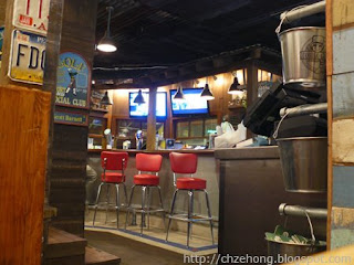
Symbolism is used in a space when attempting to represent another element that ties in with the design theme. The image above is the famous Bubba Gump Shrimp Co. restaurant. The designer wanted all visitors in the space to feel like they are on the boat and experiencing life in the open sea. There are many elements in this space that represent that feeling. The rusted ceiling material gives the feel that you are in a specific part of the boat; under the deck. The wall material also mimics this same idea. The wooden steps to the left side of the image also give this under deck feeling in a more literal way. The wood material selected for the wall behind the counter with the canopy overtop also makes the visitor feel like they are on a small wooden boat, similar to the one in the movie Forrest Gump. The wood flooring guides you through the space, with the help of the blue painted line that mimics the shape of the bar. In the movie, Forrest Gump is a shrimp boat captain which is also represented through the silver buckets on the right side of the image. These buckets are used as tools to catch shrimp in the movie. People often find unexpected items when fishing, such as license plates. The things found are rarely in perfect shape. This is represented in the license plates hung on the wall on the left side of the image. This item symbolizes the mystery and unexpectedness of the ocean. The imperfect blue and tan tile on the wall attempts to give the space an older age and worn feeling.
The pendant lighting in the space is also a very similar type of lighting that is used on many boats in the eating area, usually located under deck. The lighting in the image is used in a similar way; to emphasize the bar. This pendant lighting pushes the light away from the ceiling, making the ceiling appear darker. This again makes the ceiling feel heavy, giving the visitor to the space the idea that there is more to see upstairs. (on the upper deck of the ship) The dark colors also make the space appear smaller and more cramped, similar to the feeling one gets when stepping below deck.

Do all of these elements working together give you the feeling of being under deck? Would you change anything? Because of the dark colors and materials used in the space, it appears small. Does it make you feel uncomfortable? Is it a space you would hangout for a while, or is it a quick visit?


Image obtained from: http://i15.photobucket.com/albums/a358/chzehong/P1070821.jpg
3/9- Pragmatic

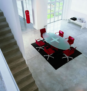
Pragmatic factors greatly affect the design of space. The office design shown at the right is a space that seems to demonstrate quite a few pragmatic woes. By analyzing spaces that have not been successfully designed, in terms of pragmatic issues, designers can learn from others’ mistakes and more successfully achieve designing truly functional spaces. Pragmatic issues deal with the health, safety, and welfare of its users, but they ultimately prescribe a space that functions well.
The space at right appears to be a conference room placed in a rather open section of the building and at the crossroads of a main circulation path and a staircase to upper floors. The main circulation path appears to run through the wide door opposite the conference table, alongside the table, and beyond to the stairwell and continued open space. The position of the conference table creates a pragmatic issue because it is placed right in the center of the opening in the main traffic path. Users must either walk around this large road block in order to properly access other areas of the building. Thus, the circulation paths are rather amiss due to furniture arrangement. The boxing pad hanging from the opening also blocks the circulation path in the same fashion as the large table does.
Another pragmatic factor that influences space is the abundance or lack of appropriate/inappropriate noise. The white, bare walls of the office space do not have any absorbent material that would reduce reverberation within such a large, high-ceilinged space. The lack of such material most likely creates loud echoes throughout the space, which is not an ideal condition for a conference space. Conference spaces are used for meetings and brainstorming among companies. With constant reverberation, the space will become both distracting and intimidating for employees. Workers may become unable to concentrate due to the constant echoes and thus, reduce work productivity. Shy employees may become intimidated by the reverberation and become more withdrawn from meetings. They may have wonderful ideas/contribution, but be too scared to come forward. Thus, the impact of noise can essentially decompose company productivity in a badly designed space.
Safety issues can greatly impact the functionality of a space. The office design at right contains rather hazardous stained concrete floors. These floors can become very slick with any water application. On most days, the floors would be rather successful. However, on rainy days, employees would track water inside the office building and create slick, dangerous floors. Employees could become injured and eventually raise insurance/benefit costs to the company. The stairs at the left of the photograph seem to be lacking handrails on the right-hand side. This lack of protection in the ascension of floor levels could also cause injury to employees and have the same effect on company costs. Despite other dangerous pragmatic concerns within this space, the designer did equip the conference table with appropriately healthy chairs. The designer placed ergonomic chairs within the space that contour to the human spine and create a healthy work environment for the employee despite having to sit in a chair for continuous amounts of time.
I brought up a point concerning weather and its direct relation to interior design pragmatics. What are some other examples of how weather (pragmatic) issues affect the design of space? How do designers accommodate these primary needs of space?
Picture from: http://www.momentoitalia.com/tutti%20file/immagini/office/PELL-OFF-BIG/ZZ1_jpg.jpg

Sunday, March 8, 2009

03/09: Wildcard - Symbolic


Nobu Fifty Seven is an upscale Japanese restaurant located in New York City. Designed by David Rockwell, Nobu Fifty Seven evokes fluidity and the imagery of an Asian river with curves and details of abalone shell chandeliers, sliced bamboo stalks in terrazzo tiles, scorched ash tables and Japanese quilt fabric. Sake barrels imported from Japan tower over the floor bar counter as diners make their way to the upstairs dining room. Polished woods, rich hues and soft lighting create an ambiance of elegance and refinement.

The interior of the space is symbolic of the authenticity and exclusiveness of the dining experience. By using rich materials and rare décor, the customers are immersed into the Japanese culture. The space is upscale and tranquil, symbolic of the Asian lifestyle. The atmosphere allows the diners to relax and enjoy their dinner without the stresses of the day’s earlier activities. It empowers the diners to focus on the dining experience and visiting with their party, rather than the implements of the space. These elements are symbolic of a dinner in a Japanese residential environment. The traditional Japanese dinner is a formal meeting, with delicate dishes and proper conversation. This restaurant symbolizes that tradition and allows the guests to escape to Japan for an hour or two.

How would the dining experience be affected if the materials and décor in the space were changed? Are there any materials that do not fit the symbolic Japanese atmosphere? If yes, what suggestions do you have to make the space more authentic? If you were to visit this restaurant, would you feel like you were in upscale Asia?

Photos courtesy of http://www.noburestaurants.com.

Preferential 3/09


The Designer of this space preferred a more contemporary feel of design. The architectural elements of the space that were already in place were very streamline and clean, very rectilinear. There is an evident theme throughout the space with the polka dots the designer has chosen to use. The designer uses the three polka dots and lines throughout the space on different elements to bring these three different functional areas together. The living room area, the dining area, and the hallway are all separate areas, but with the use of the polka dots repeated in each area the designer has made all the areas cohesive. This pattern is even found on the floor as well. There are bright red circular rugs leading the people who use this space, throughout the space.

You can tell that the designer wanted this space to have a strong sense of repetition throughout the space with the continuous use of these objects. The materials used in this space are appropriate. All of the materials in this space are sleek and smooth, keeping along with the contemporary feel that the designer wanted to bring to the space. All of the furniture is clean lined, with smooth finishes. Also the furniture is neutral tones, to make sure the accents pop. The walls in this space are very clean and sleek as well. The main wall is white, while the two dividing walls have a sleek, dark blue tile pattern on them. The color scheme the designer chose for this space is very enhancing to the space. The color scheme in this space is very contrasting. The use of neutral tones in most of the space, then the accents of red throughout the space in each area brings interest to the space. All of these elements are preferential elements from the designer.

BEHAVIORAL : 03/09


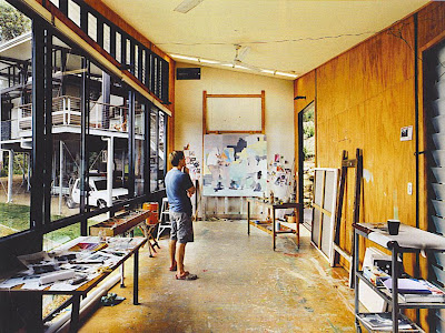
The image below is of the painting studio of artist Stefan Dunlop. The studio is part of he and his wife’s newly built dream home located on a seaside hill in Noosa, Australia. The home and studio were built by their neighbors, Bark Design Architects, and the couple was fully involved in the process.
When thinking about designing a space meant specifically for creativity we must keep in mind that in this state of creativity, we make ourselves most vulnerable. This means that our behavior is strongly influenced by our surroundings, taking notice to the smallest of details.
When you initially look at the image of this studio it doesn’t appear to have any great architectural value or order for that matter. But the architects and artists took great care to design and build a space which would affectively accommodate the behavior specific to Dunlop. For example, Dunlop’s paintings are often on a very large scale so it was necessary to create an extra large entrance with a very tall angled ceiling. In addition to this tall ceiling, it was also necessary to create a space which was long and narrow so that Dunlop would have plenty of room to step back and get a good view of his large works. The giant wall of glass creates plenty of natural light, not to mention an inspiring view and the building’s orientation from east to west avoids direct sunlight which would obscure sight of the paintings. The walls and floors are made of plywood, having the ability to withstand strong wear and tear including paint splatters. This enables the artist to feel comfortable to create rather than having to worry about creating damage to the space. And finally, the exterior was clad in corrugated tin so as to echo the adjacent water-storage tanks.
If asked to design your “perfect studio” what would be some of the architectural features necessary in order for you to feel most comfortable to create?

Composition: 3/9


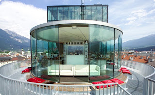
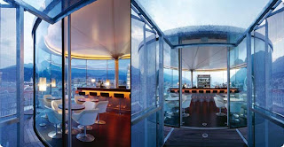
The compositional aspect of an interior directly refers to how the designer applies two-dimensional and three-dimensional composition within the space and how effective it is. In this café, the use of geometric shape is mainly used. Three-dimensionally, you see that the chairs, tables, and sofas all relate to this overall curvilinear and spherical theme that is carried throughout the shape of the actual space itself. The straight edges of the rectangular bar creates contrast compositionally with the rest of the space. The straight lines that section the ceiling design also relate back and connect to the bar shape. The walls are from floor to ceiling glass, which is also connected within reflective materials and the ceiling, which is made up of a translucent membrane. The initial shape of the entire space is also repeated on the outside through the patio. It is repeated through the exterior railings, as well as the furniture that frames the space.
The scale of this space is overall human scale, but this really only depends on where you are in the space. Inside of the glass walls it is definitely human scale. On the contrary, if the viewer in standing outside of the glass walls on the patio, the space is of monumental scale. The framing of these gigantic mountains and infinite sky brings the viewer down to what seems like the size of an ant. Also, because the space is on a roof top, it causes the viewer to feel even smaller, as they are then enabled to look up, down, and every direction. The proportion of the objects within the space are very much balanced. This is so, because although the objects vary in size within the space, this variati
on is an even one. Nothing in particular is overly sized or too small for its surroundings.

How would the space change if the walls were not glass and did not create a connection to the outside? Do you think that the space would be easier to read if the shape of the bar reflected the rest of the space? Why do you think so? Do you think that the human scale of the patio area would change if this café weren’t placed on a roof top, and just on a street side? Please explain your answers.