Monday, February 16, 2009

2/16- WILDCARD- Symbolic


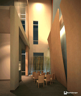
The image to the right shows the interior of a chapel located within the Norton Brownsboro Hospital complex. A successful place is always synonymous with a scheme of symbolism, and places of religious context are definitely no exception to this rule. The designer wanted to create a specific atmosphere within the space above in order to create the appropriate behavior for the context. Several strategies were employed symbolically within this hospital chapel in order to comfort the user spiritually despite any tough medical situations. First, light was used to create a dominant focal point at the front-central point of the room. Thus, upon entrance, the eye is drawn both forward and upward in order to emphasize the presence of the Holy Spirit within this space. The idea of the Spirit’s presence will both comfort and welcome visitors at first glance into the area. The long, narrow window directly below the light’s hot spot is another key element in creating a central focal point. The narrowness and tallness of the window catches the eye’s attention and then creates movement toward the “comforting” light above. Thus, the designer has used vertical movement and vertical emphasis in order to draw the eye upward towards the heavens. The layout of the space is also effective in creating religious symbolism within the space. The traditional church/cathedral layout that has been in use for hundreds of years includes a central nave between two smaller aisles and rather high ceilings. This space takes a twist on the traditional layout by using only one aisle beside the small nave. However, the layout is still recognizable as a “church layout.” The tall ceilings within the space add to the familiarity recognized by visitors. The wall panels on the right hand side of the space are alternatively concave and convex in three-dimensional quality. The convex panel seems to protrude into the visitor’s space, as it is right beside the sanctuary seating. However, this intrusion of soft, light wood seems to be a symbol of God’s presence once again. The leaning nature of the panel seems to communicate that the Lord is standing right beside the visitor. Thus, the concave panels communicate that the visitor should not be afraid to “lean” on the Lord for help in a time of trial. Hospitals can be places of terror and fright, and the chapel oftentimes becomes a place of refuge and peace, thus the design of such an important place must communicate this peace. The color scheme used within this space is one of calmness. The cool, yet earthy celadon green combined with the warmth of oak and a soft cream color create an environment anchored with stability and peace. The space communicates a feeling of invitation and softness. This further encourages visitors to have spiritual consultations with their Lord.

What would happen to this space symbolically if the central ceiling light was removed? Would the space still communicate the same atmosphere and overall values? How would the symbolism of the space be affected if the walls were not differentiated by curves, but just normal planes?
Sunday, February 15, 2009

2/16--Compositional


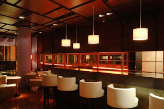
A compositional interior relates to how the designer applied two-dimensional and three-dimensional composition within the space. In this bar area, the main shapes that you see in the space are geometric in nature and are then related to three dimensional forms in the lighting and bar shapes. The ceiling is made of a rectangular and square pattern. There are also square-like shapes that line the backdrop of the bar. The three dimensional rectangular bar relates to square and rectangular two dimensional shapes. Also, there are circular bar seating and couches for the guests to sit on. The circular shapes can be seen three dimensionally in the lighting fixtures that hang above the bar area and the large column in the space.

The scale of the space is very much human; the only extremely large object is the column that is further back in the space. Although we don't know the exact height of the ceiling, we can assume that the lighting that hangs over the bar itself helps to lower what could be a high ceiling and makes the user not seem so small within the area. The proportion of the objects are very balanced; the bar chairs aren't overly huge and the couches in the space aren't over-stuffed or over-sized.

How would the space be different if the ceilings were much more monumental, yet the size of the furnishings stayed the same? If the designer had used more rectilinear elements, do you think the fluidity and softness of the space would be too affected?


http://architecture.myninjaplease.com/wp-content/uploads/2007/04/4-bar-view.JPG

2/16--Preferential


A preferential interior relates to what preferences are discernible within the space and if they are appropriate or inappropriate. In this interior, the designer uses a monochromatic color scheme of dark gray with white accessories. The dark gray and white are contrasts, but are both achromatic colors that don't detract from one another.

The main focal points of the room are the three white light fixtures that hang out from the wall. They are a point of visual interest that you see right before the viewer begins to walk around the wall that they hang on. They are contrasting with the simple, clean designs within the rest of the room, and are visually similar to the accessories that are on the side table.

The lightness of the light fixtures add a bright element to a rather dark room. But just beyond the wall that the light fixtures hang on are a hallway that is extremely lit and creates a separation between the two spaces.

The darkness of the room with the wall separating the sitting area and the brighter hallway helps to create a more intimate, private area. The lighting is dim and limited. The wall that extends into the room seems to create a barrier between spaces in this interior and the curtain hanging on the back wall seems to add to this effect.

This space is very clean and simple and modern. If the designer had used brighter, and more than one color, do you think that the room would have the same feeling of a private sitting area? Do you think that adding more color would make the room feel larger/smaller?

02/16, BEHAVIORAL, Veronica Polinedrio

VATICAN MUSEUMS

The Vatican and the Vatican Museums are one of the most visited locations in Rome throughout the year, both by local and foreign tourists.
It counts over one hundred rooms in which the papal collections have been placed over the centuries.
Upon entering, visitors are walked upstairs in a tall, round room where they are lined up and moved into the next room. The entire museum works this way – royal red cords define the walking paths that visitors must take while admiring the beautiful pieces in the galleries This is meant to keep the massive crowds moving at a regular pace and to keep visitors at a fair distance from the art works.

Hallways are ‘one-way’, only allowing visitors to walk in the same direction. These corridors usually take into big famous galleries, and they are also fairly long - minor works are typically located along them moving people easily and fast through them.
The rooms are imposing - not only are they wide, but also really tall. Some of them are over thirty feet high encouraging people to look up and observe the frescoes.

Additionally the lighting used in the space, both natural coming through the windows and artificial, emphasizes specific works and makes people walk toward and look at them. Track lighting, added recently, is particularly important in helping visitors look up and observe the richly decorated ceilings of the galleries. If the designer had not use such device, such works would have been partially ignored – lighting here is able to recall people’s attention and make them aware of what is on top of them.

In the space, people are extremely controlled and their behavior needs to be accustomed to the character of the place. As part of the papal state, the Vatican Museums require people to behave respectfully and politely – communication must be soft, and visitors in some spaces are actually required not to talk. An example is the Sistine Chapel where for its holy and sanctified character visitors have to keep their voice down while standing in this mystical and dark space, barely lit by natural light coming through the windows. Here light emphasizes the famous ‘Last Judgment’ Fresco that imposes itself over the crowd and literally makes everyone’s head turn to it.


Would you feel too controlled in such a space? How do you think you would behave in such a space?
Do you think these are good strategies to keep large crowds of people moving through the space? Or do you think the designer should employ other ways to direct visitors through the space?

02/16: Pragmatic


The shape of the house has been ever evolving from carefully divided, privately sectioned-off rooms with individual functions of the Victorian era into the homes of today with their open floor plans and multi-purpose gathering rooms. What we see in this image is one such interior. Pragmatically this room has to serve several purposes: Sleeping, relaxing, working, reading, and perhaps some informal dining. It can be assumed from the furniture of the space, as well as the fact that more than half of the living space is grouped together in one room, that the person(s) who are intended to live there are young professionals.

Eileen Gray’s cigarette table and the 60’s arc lamp show a taste in classic modern design pieces, and the open space of the room gives the impression that the intended user does not need a lot of privacy or protection against noise. Pragmatically there is ample room for circulation between the different functions of the space and the light well in the corner provides a large amount of natural light that is then reflected and multiplied by the mirror.

This space was obviously intended for a single person or a couple without children because of its lack of separate bedrooms and no differentiation between work and play areas. Who do you think that this room was intended for? What does the single paint color do to a room that large? What kind of problems are inherent in a multi-purpose room like this?

02/16: SYMBOLIC


A key way to understand the concept of an interior space is to comprehend the different components that they are made of. One key component of a space is how it is symbolically portrayed. These images are of interiors of the Hyatt Regency in Calgary, Canada. Different ways in which a space can communicate symbolically are through material usage and placement and signage. Upon entering the hotel, the front lobby with the reception desk is the first thing you notice. The main component of the space that draws you towards the desk is the architectural detailing on the ceiling. The shape of the detailing is an elongated oval with the pointed end directly facing the desk. Following the shape of the structure leads you to the desk. The ribbed details and lighting of the structure emphasize the intended path. Continuing the same rich yellow, brown and orange tones in the desk as in the ceiling creates a link between the two.

In the guest rooms of the hotel, there is a different feeling to the design. The rich, earth tones seen in the lobby give way to muted grays, creams and white. The only link with the two spaces can be seen in the wooden headboard. This difference in color choices makes it seem as if the guest rooms are meant just for sleeping. The designer wanted guests to come and experience the hotel’s different amenities and just use the bedrooms for sleeping purposes only. The calming tones help to relax the guests and encourage them to unwind after an eventful day in the city or hotel. There is not as much lighting in the guest rooms compared to the lobby. This also contributes to the intent of relaxing.

However, like the main lobby, other parts of the hotel symbolically add to the richness and “homey” feel of the space. The lounge area uses rich wood tones, muted lighting and comfortable leather chairs to create a relaxing atmosphere for the guests. The large lighting fixtures hanging from the ceiling help to lead you through the space towards either the large bar area or the fireplace. Adding warmth to the space helps guest feel more at home.