Friday, February 6, 2009

02/09 PRAGMATIC


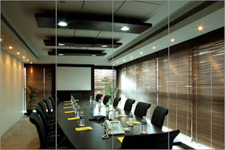
In studio we have learned how to analyze and evaluate spaces. Five ways to do this is through the factors of preferential, symbolic, behavioral, compositional, and pragmatic evaluation. By using a pragmatic approach we can see how the design of the space above relates to the design decisions based on the function of the space.
The space above is a meeting room that would typically be found in a large corporate company. Therefore, the function of the space is simply to hold professionally conducted meetings. In order for the space to be designed properly with its function in mind the existing conditions needed to be addressed. The existing shape of the room is rectangular with the center portion of the ceiling elevated, also the room is surrounded by windows on at least two sides. With these factors already established, the designer had to make the decision of how to properly design the room to make it functional for the needs of the users (i.e. professional, private, focused, business oriented). Having that in mind, it looks as if the designer wanted the space to seem longer. In order to create this exaggeration a long rectangular table was used. Following that the designer turns to the ceiling to reiterate their purpose. By taking full advantage of the extra space created by the elevated portion of the ceiling the designer painted black lines that run horizontal, reiterating the length of the room. The recessed lights on the lowered sides parallel those black lines, again reinforcing the length. By using light fixtures that run perpendicular to the sides of the room the designer created a contrast that helps keep the space interesting. On the window walls the designer has used wood blinds to create a more private atmosphere while still allowing the light come in.


Considering these observations, answer one of the following:
Do you think the designer was successful at creating a space with its function in mind? If so, why? If not, what would you have done differently?


What kind of effect do you think this space would have had if the ceiling was all one height? If there weren’t any windows?

Image found at : www.jja.in/services/interiors.html
Monday, February 2, 2009

02/02 BEHAVIORAL


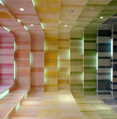
The designer of this space intended for people to feel confused and disoriented within this space. When a person walks into/ through this space many different reactions are possible. The reasons for these feelings are the high levels of contrast in this space, found both in the multiple bright colors used as well as the range of line widths. The designer is also trying to “fool” the eye of the viewer with the application of color. If you look closely at these two pictures of the space you can see that the room gradually gets larger with each rectangular area added, but with the darker blues and violets applied at the end of the space it actually pulls the room in making it appear not to get larger when looking at it straight on. These elements also affect the traffic pattern within this space. When walking into this space a person has no “set” direction as to where he or she should go to maneuver around the space. The only point of emphasis to even direct the person is the large white sign that is hanging in the room that contrasts with the bold colors in the space. The use of line also helps with the flow of the space because horizontal line is dominate throughout the entire space pulling the person forward on into the entire room.

The lighting in the space kind of acts as directional lighting, highlighting the wall detailing on either side of the space, while drawing the viewer’s eye in. The lighting in this space is not dim intimate lighting that would encourage soft communication, it is more of a bright lighting that encourages “loud” communication. The interior flow as I said before and also as you can seen in the pictures, pulls people through the space not encouraging much lingering or a “lounging” feel.
How do you feel when you look at this space? Does this space pull you through or make you want to linger? Is it successful or too overpowering?

Sunday, February 1, 2009

02/02: Preferential


(image source: blog picasa slideshow)

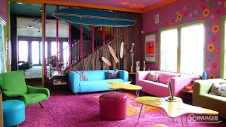
The designer of this space has strong preferences for a retro-referencing design while still displaying slight sophisticated modern tastes. Seventies themes of daisies, surfboards, hearts, and whimsical icons dot the walls and ceilings in highly saturated tones set a tone of fun-loving irreverance. The mid-century modern lines of the coffee tables and arm chairs, along with the surf board suggest a California modern coast house, but the mismatched tropical colors and shapes cover up any amount of self-importance or seriousness.

Because of the clean lines of the staircase, the relatively high ceilings and the open expanse of the room, it seems that the house could indeed have been a more modern style, but the owner was clearly trying to ‘dress it down’ as if to create a beach house out of it. The variety of textures- seen in the fabric on the walls, the carpet, the different upholsteries on the furniture, and the smoothness of the coffee tables and ottomans- give off a deliberately mis-matched feel even though the color palette remains loosely unified under the category of ‘all tertiary’.

The openness of the space, the variety of textures and colors, and the laid back 70’s/California/surf themes gives the impression that the designer of the space wanted several people to be able to congregate in the room and feel relaxed but stimulated by their surroundings. Plenty of surfaces invite spreading out and not worrying about picking up after oneself while the informality of the color scheme and abundance of seating surfaces suggest hanging out on vacation.

What do you think the designer wanted people to do in this space? Was it successful? Do you see a conflict between the design choices or do you think there is a unifying element?

02/02:PRAGMATIC


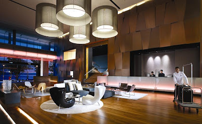
As interior design students we need to take the steps to better understand interior spaces. Using the factors of preferential, behavior, compositional, symbolic, pragmatic we can begin to see the meaning and the value of interiors. For this analysis the factor pragmatic will be used to better understand the hotel lobby above. Pragmatic relates to the design decisions that are made due to the existing shape of the building or the space. This interior space is horizontal with all needed functions being in the long space. The traffic patterns are clear with entrances and exits on both sides of the horizontal space. With the wood flooring being laid from door to door it moves people throughout the space. Other factors than the floor give a clear reading to other functions like the restrooms, front desk, and elevators. The front desk is the middle of the long space and is lit. On the opposite side of the space the restrooms and elevators have a clear reading with being lit above. All the individual functions are related to each other, as they should be, by sharing the same color scheme and style. There are many functions going in the space with the front desk, lounge (bar), elevators, stairs, and restrooms. Even though they all relate, they all have there own distinctions. There is enough adequate lighting in the space with natural and ambient light. Noise in the space could be an issue. The lounge/bar area could be noisy and noise could travel throughout the space.

What do you think would help the noise issue coming from the lounge/bar area? Would something like a dropped ceiling or partition help?

Image source: http://www.medretreat.com/destinations/malaysia/accommodations/g_hotel.html

02/02- SYMBOLIC


When asked to comprehend the individual components of an interior space from a symbolic evaluation, it seemed fitting to evaluate my church, which seems should be overflowing with symbolism. To the casual observer, Southland does not overtly advertise any traditionally rich iconography, but upon closer observation the design of the interior is full of subtle symbols of the Christian faith. Upon entering visitors are directed not only by signage, but also by volunteers greeters shake hands and point in right direction, then to a seat. Although this is not the design of the interior, because the space is so large, filling it with smiling faces has made the expansive ceiling feel more like home. The ceilings are so high, creating one of two effects: one, because so many people are packed into the space, it gives the impression of more space; while two, it feels like you are looking at the sky, making the small lights look like heavenly stars. The permanent colors chosen for the space are subtle tans (on the walls) and purples (on the chairs), tan being a calming color and purple being the color of royalty. There is stadium seating, which makes viewing the service more accessible to those in the back row, so they are able to feel more a part of what is going on. The lighting is constantly changing, being dimmed and brightened to fit the service taking place, which enriches the experience for visitors.


If you have ever been to church, how has the interior design, choice of materials, colors, and layout enriched your experience there? If not, what are some structures that create the same feelings in other ways? What do you look for in those places which make the experience full of life?