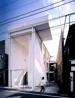

Design is not simply a pretty picture. Designers' ability to integrate function and beauty while solving issues is what makes design a lot more complex than any other form of art. Designers can never ignore the pragmatic
 aspect of design, which is making design choices and approaches based on the function of the space as well as the existing condition of the site and the architecture itself. This space, in particular, functions as a restaurant space of a local neighborhood located in a tight, narrow site between two buildings. In this very limited space, the designer took advantage of the rectangular shape of the floor plan to configure the composition of the space. Circulation is achieved in a linear rhythm and direct manner. Streamlined furniture is kept to a minimum and arranged along the wall and columns, which provides a circulation path in between that assists visitors to their seats and allows employees to easily travel from and to the kitchen/bar area in the back. An open facade that connects the space with a small terrace creates additional circulation paths to the space. Visitors can leave the restaurant space without interrupting the circulation path between the dining tables. The open facade rises continuously to the third floor and integrates the open terrace with the interior space. This facade brings light and an open feeling into the space and turns the entire three floors into one interior unit, which enlarges the space even further. Despite the small square footage, this space exudes an open and airy vibe since the designer chose an achromatic color-scheme with white dominating and expanding the space and accents of black to bring contrast to the architecture and define the furniture. In addition, white curtains enclose the entire space and enhance that light and airy feel into a more dramatic effect. Small lighting fixtures are installed throughout to illuminate the restaurant at night without overwhelming the space. Meanwhile, the bamboo wall/fence not only defines a boundary with the adjacent building and provides privacy, but its natural qualities also bring a sense of nature into this industrial-looking space.
Do you think the designer successfully executed his goal on defining circulation and achieving openness in this limited space? If not, what are the features in the space that needs to be altered or even eliminated to reach that goal? What do you think is the main emphasis in this space that draws the visitors to stop and walk in? Would the space carry a different effect if color were added?
Image Source:
Jodidio, Philip. Architecture Now! 3. "Shigeru Ban: Glass Shutter House." Cologne, Germany: Taschen, 2008.
This comment has been removed by the author.
ReplyDeleteI agree that there is a strong presence of linear movement within the space. It appears that the architect used vertical, horizontal, and diagonal linear movement. This shows that the architect took advantage of all available options for maximizing the function and asthetic of the space, which as mentioned before is crutial in such an urban setting. The elimination of unnecessary exterior walls alows for the optimum advantage of space. However, I think that the two horizontal platforms should be made translucent so as not to break up the vertical movement of the space. IT appears the the main point of emphasis is the seating below because in comparison to the white of the building, it ways it down like an anchor. Overall, I beleive the architect did a good job taking advantage of the available space.
ReplyDelete