 McDonald's
McDonalds’ is the most famous American chain of fast food restaurants in the world. Located in almost every country in the world, the McDonald’s Corporation owns a monopoly in hamburgers sales. Its Golden Arches have become a status symbol of America and everyone associates this logo to the name, food and service. A customer knows that, when he sees the golden arches tower over the sky, he is going to get a fast service and an exclusive selection of food that he can only find there. 
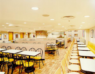
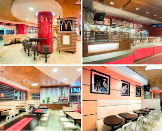
The interior space resembles the logo – yellow and red are the primary colors used in the restaurant and serve to remind the users about what they are getting from this place. A bright and well lit space is essential for the corporation. By using very vivid colors – yellow and red – in a very achromatic space – white walls and black furnishing – the McDonald’s Company makes its customers know about their business philosophy. Customers are unconsciously induced to walk in, eat and walk out. The key words of this space are fast, business, money. People do not expect much from this space either – they know they are in the restaurant for business only.
When entering the space, customers are stimulated to walk straight to the counter. The large, bright food panels are the focus of the space and are emphasized by the straight line quality of the tiles on the floor that walk customers directly to the ordering point. Once there, they order their food and move aside to let the customers behind them place their purchase. Once again, the space encourages users to move fast and act business like. The area is not meant for the customers to linger, but it rather makes them leave after their purchase.
The music is kept at a medium to low level, and it is usually fast paced music. This device is used together with the vivid colors and bright light to keep the customers active and animated. Unlike at Starbucks, for example, where people are invited to stay by the soft light and comfortable space, at McDonald’s customers are meant to be kept “awake” and dynamic, so that they leave soon. McDonald’s is known after all for making money when its customers buy, rather than hanging out in the restaurant in a laid back mood.

The interior space resembles the logo – yellow and red are the primary colors used in the restaurant and serve to remind the users about what they are getting from this place. A bright and well lit space is essential for the corporation. By using very vivid colors – yellow and red – in a very achromatic space – white walls and black furnishing – the McDonald’s Company makes its customers know about their business philosophy. Customers are unconsciously induced to walk in, eat and walk out. The key words of this space are fast, business, money. People do not expect much from this space either – they know they are in the restaurant for business only.
When entering the space, customers are stimulated to walk straight to the counter.
 The large, bright food panels are the focus of the space and are emphasized by the straight line quality of the tiles on the floor that walk customers directly to the ordering point. Once there, they order their food and move aside to let the customers behind them place their purchase. Once again, the space encourages users to move fast and act business like. The area is not meant for the customers to linger, but it rather makes them leave after their purchase.
The music is kept at a medium to low level, and it is usually fast paced music. This device is used together with the vivid colors and bright light to keep the customers active and animated. Unlike at Starbucks, for example, where people are invited to stay by the soft light and comfortable space, at McDonald’s customers are meant to be kept “awake” and dynamic, so that they leave soon. McDonald’s is known after all for making money when its customers buy, rather than hanging out in the restaurant in a laid back mood.
Do you think that the space is appropriate for the philosophy of the Company? How do you feel when you use this space? Pressured to leave? Uncomfortable? Do you believe the symbols employed in the space work well? How so?
After reading the article, "Ronald McModern", I think I should make a precision about McDonald's restaurants in Europe, and in Italy especially.
ReplyDeleteWhen I was in Italy, I rarely went to McDonald's because my friends and I considered it an "exotic" restaurant! Believe it or not, but McDonald's in Europe is EXPENSIVE!!! Last summer, two cheeseburgers, two drinks and fries amounted up to 20 Euros = 30 Dollars!!! That's crazy, but for us McDonald's is almost considered a fancy restaurant! In Rome, there is one of the most famous McDonald's restaurants of Italy and of Europe! It is known because you eat while admiring Roman ruins. The design of the space is very complex, because it is developed around the theme of ancient Roman classical style. The space is very rich - plants, ruins, water, frescoes - and it is extremely helpful at attracting people in the space, because customers know that they get more than just food: art, history and good design, which I believe is more powerful than just tables and chairs in a well lit space.
So, if I was to advise the McDonald's Company, I would tell them to go for the good design that attracts people in the space.
McDonald’s is not Panara. They are a fast food company. They don't boast comfortable restaurants, they don't promote calm environments of customers to relax. Their design philosophy ties closely into their concept. They want their “fast food” to be fast. Therefore their design is appropriate. Chairs which are comfortable enough to keep one content for an amount of time, yet do not allow for lingering. The lighting is bright which promotes activity and movement, instead of dimmed, more intimate lighting, like that of PF Changs, which encourages visitors to stay for a while. McDonalds design philosophy works well with the spaces because the more people they can filter through quickly, the more money they make. In Asheville, in the downtown Biltmore area, all the store, restaurants, and gift shops are supposed to be designed on the exterior to look the same (the same orange slate roofing, brick siding, etc.). There is a McDonalds downtown, the exterior is beautiful and you would never think it was a McDonalds, but the inside is very typical of a McDonalds. (Here are some pictures) The only thing that made it a little strange inside is there is a fireplace and there is a grand piano. Ironically though the furniture and organization of space, even colors and lighting are similar, which is appropriate for the philosophy of the fast food restaurant, while merging with the upscale downtown.
ReplyDeletehttp://www.abbottconstruction.net/_wp_generated/wpe714bbbe_0f.jpg
http://lh5.ggpht.com/_Z1JyKC9mJJE/SFQsybrXNTI/AAAAAAAAAZQ/QHKqxpjFoFw/mcdonalds_dec07sm1.jpg
In the latter part of high school and these first few years of college I was going through a 'McDonalds is ew' phase. I tried to avoid it as much as possible for, well, health reasons. And even if I broke down and wanted a quick McFlurry I hadn't been inside a McDonald's in a while.
ReplyDeleteNeedless to say a few weeks ago I thought it'd be quicker to go inside than to wait in the long drive-thru line. I was surprised at what I found. I guess I thought other people had forgotten about McDonald's when I had but I was wrong. It's an iconic restaurant, even as other newer, hipper, healthier places are coming up - McDonald's stays the same. You see other places (Taco Bell, Arby's) working hard to renovate and improve their outward image but you never see McDonald's trying to change.
I think the space is appropriate for the company because people don't come to McDonald's for an atmosphere. They come for the lowest common denominator. They want a burger and salty greasy fries and an all-american Coca Cola. The space is not design for the eating of the food or for the comfort of customers who eat in. It's designed for the Getting of the food. The most space is in front of the counter, the surfaces are hard and bland, the chairs aren't flexible, you're not encouraged to hang out there with your friends.
McDonald's thrives on more people getting the food and leaving than dine-in customers and that is what the design encourages.
The space suits McDonald's well. Since they want people to order, eat and get out, the atmosphere does that. As Veronica said, it's part of their strategy to move people along quickly. If people wanted a different atmosphere they would go somewhere else. You go to McDonald's to eat, not to have a conversation or hang out with friends.
ReplyDeleteWhen I'm in the space I just want to eat my hamburger. It not uncomfortable for a customer to sit and eat for a few minutes but after that you need to move. In this way I think the symbols work well. All parts relate back to the logo. If you want food fast, there's only one place to go.
I found Veronica's comment about the McDonald's in Europe to be interesting. Who knew that across the pond, it was considered an exotic place to eat? It also seems like they are a little more upscale than the ones in the states. What does that say about America? Perhaps we are use to the way a McDonald's should look and change wouldn't be a good idea. Though I wouldn't mind it.