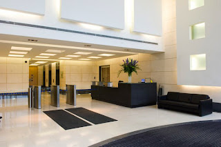
 The composition of this space is incredibly unified. The use of both color and shape come together to create a space in which all elements work together. The space demonstrates a strong combination of monumental and human scale. Upon entering the main lobby area, the space is large and open, with a very high ceiling. The monumentality of this initial impression works well as a demonstration of the grandeur of the space. On the other hand, the smaller scale of the reception and elevator areas gives a little more intimate appeal, more fitting to the human interaction within the space. Despite the vast difference in scale, the two areas work well together and the transition from one to the other is quite smooth. This cohesiveness of composition is facilitated by the similarities in color, shape, and form within the space. Rectangular shapes and forms are carried from the initial composition of the floor plan to the three dimensional details of the space. The rectilinear patterns, designs, cutouts, carpeting, and lighting on the wall and ceiling easily emulate the space’s layout. Likewise, the entire area is grounded by the strong forms of the sofa and counter. The harsh contrast between the light white/cream walls and the dark accents of the furniture and floor pattern also creates unity between the two scales while bringing more visual interest to the entire composition.
What would happen if more color were used within the entire space, instead of just as accents? Would darkening the architecture within the space create a different effect? Would the use of more curvilinear forms for the furniture and accents create a more interesting contrast within the composition, or would it merely make for an inconsistent space? Please explain your answers.


I personally think that incorporating more color into the space would make it distracting. The designer intended to highlight the scale of the architecture and specifically address that the grand lobby represents the company's high status. In other words, the designer used the architectural form of the building to send that message to the visitors, hence, using more color would defeat that purpose. For instance, the use of color would cut off the transition between the lobby and the intimate reception area because its contrast would draw people to pay attention to that color.
ReplyDeleteMeanwhile, darkening the interior would make the space less welcoming since dark colors tend to intimidate. As of using more curvilinear forms, I think it is appropriate as long as there is repetition that would create unity in the space. However, curvilinear forms tend to make any space appear less formal. Therefore, the use of curvilinear forms might need to be kept to a minimum, especially if this space is a part of an office building.