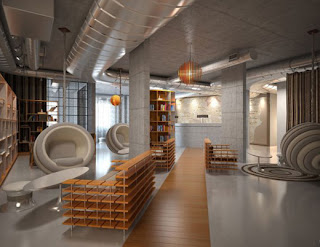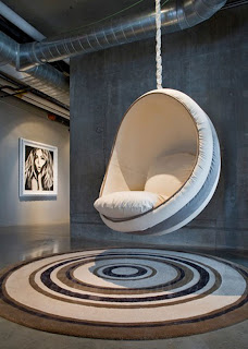
Preferential design decisions are based on preferences of designers and how they showcase that within a space. These decisions may be what the designer wants, but what is important is if those designs are appropriate or not for the space. This space is a hotel design for the NYLO Hotel in Plano, Texas. The main design is meant to be an urban, exciting and fun lifestyle experience while on the road. It is meant to be a business hotel that is a bit different. This space shows a contrast and compliment between two different aspects in the area: new technology and affordable upscale hotels. The space itself is a very urban geared design with exposed concrete walls and a lot of tan and beige tones, seen through the wooden chairs’ couches and the upholstered hanging bubble chairs.
The urban influences are very apparent. There is a mixture of curvilinear elements and rectilinear elements that compose the main lobby area. The architectural elements are extremely neutral and rectilinear. The wood elements are used in the bench/sofa seating and bookcases are placed around the perimeter of the room to create a boundary and are the main supply of color.
The curvilinear elements are found in the tables, the light fixtures hanging down from the ceiling, the bubble chairs and the rugs to the right of the reception desk.

They are repetitions of circles within each element. The light grays that they are composed of help to create a soft, soothing interior color scheme. They give the impression of a very upscale, high end hotel, which contrasts what it actually is.
The lighter, softer grays help to add to the lightness of the space, since the majority of the space doesn’t house many lights. On the back wall, there are a couple of windows, and task lighting over the desk, but the majority of the light coming into the space is reflected off of the metal HVAC equipment.
Although the designer wanted to make the space more modern and up-to-date, they chose to use neutral grays and tans. If they had added a bolder color, such as red or orange, do you think that the space would have a different feeling? Do you think that combination of the rectilinear and curvilinear furniture elements work? Would the lobby have a different feeling if everything was rectilinear, like the wooden slat bench, or if the seating was all like the bubble chairs hanging from the ceiling?
Photos from http://www.top-hotels-restaurants.com/2008/07/nylo-hotel-texas/
I believe that the neutral color-scheme is appropriate for the space. As Meredith mentioned that this hotel is designed to serve guests who are traveling on road trips. Therefore, these tired guests need a quick resting place that will provide them with relaxation before they get back on the road. The neutral color-palette is light and soothing, which calms people down when they enter the hotel. This hotel can be really dynamic and exciting if it were painted with vivid colors, however, guests who are tired from driving on the road can get nervous and be overwhelmed with the bright hues in addition to the variety of shapes and lines in the space. I think the contrast between rectilinear and curvilinear furniture is already working with the use of neutral coloring, however, it would look better if one was more dominant the other. Otherwise, the space can look disconnected and confusing. For instance, if the designer decided to focus on more curvilinear quality, then he/she should have decreased the amount of rectilinear features in the space, and vice versa. Overall, the urban, industrial feeling that the designer intended to show in the space is working through the use of geometric shapes, streamlined forms, neutral color palette, exposed materials, and exposed duct on the ceiling. The space certainly gives a contemporary feel while keeps the fun going with the shapes of the furniture.
ReplyDelete