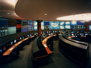
The following composition of this particular space is very specific and deliberate. The three dimensional elements of the space are curvilinear, like the circle created along the wall, and are repeated with the overhanging ceiling, as well as with the large seating area. This repeated shape allows for organization and precise traffic patterns, which are important in a work environmental and allow for less distraction. Furthermore, the scale of the space is quite large, giving the interior a feeling of importance, which overall suits the space due to the official activity happening within it.
However, with its monumental quality, all the aspects of the space are rather proportional. The wall, the main focal point of the room, is extremely large. But with the large wall follows the large seating arrangements which have been constructed to repeat the shape, as well as the size of the screen. Therefore, although the wall may seem proportionally large, the rest of the space has been altered so that a certain balance is created in the room.
Compositionally, the space is very rounded. The repetition of a constant curvilinear form creates order in the space. Furthermore, with each repeated form, a new area is designated, like the center lighting area constructed by the use of another circular shape. This separation of spaces allows for optimum function and order.
Compositionally, what is the most successful element of the space?
Compositionally, what is the least successful element of the space?
If another repeated shape was used, would the space be as successful?
I think the curved desk elements are the most successful compositional parts in the space. They introduce the motif and then the ceiling echoes the curve, as well as the walls. The columns throw a wrench in the composition of the space, although I understand it may be necessary. In that case it would have been better to paint it another color to create the illusion that it wasn't there. I think if another shape were used the space would have been more confused and not as easily readable.
ReplyDeleteIf another shape was integrated into this design the flow through the space would not be as successful. The gentle curvilinear lines are clear, and makes occupants aware of traffic patterns. Compositionally, I would definitely say that the computer desk design is the most successful. It provides a work environment with limited distraction. Each chair is positioned far enough apart from the one adjacent to it that allows for an adequate work surface. The computer desks are designed to be seen as one continuous unit that also allows for minimum distraction. For example, you won't be distracted by what other people around you are working on. I think the least successful element in the space is the ceiling lighting on the right of the image. Although it does a good job of helping to seperate space, the light is bright enough that it would project a glare on the computer screens below it. This would cause problems for the individuals that chose to utilize the computers in the back row.
ReplyDeleteI think the most successful element in this space is the use of the semi-circular shape, it is repeated throughout the entire space, through both the architecture, such as the dropped ceiling, and the built items, such as the rows of desks.It all works together, to enhance the space. The least successful element in this space are the columns, even though they are necessary, that interrupt the even flow across the space, with its horizontal emphasis, the columns break up that horizontal flow, in order to try and reduce this interruption the designer could have tried to camoflauge, or blend them a little more. I do not think that another repeated shape is needed in this space, but if another repeated shape was used i think that it would have to been chosen carefully to not take away from what is already created in this space.
ReplyDelete